
FOR A DEEPER DIVE INTO ETF PERFORMANCE AND RELATIVE VALUE SUBSCRIBE TO THE ETF INTERNAL ANALYTICS PACKAGE HERE
LAYOUT (Organized by Time Period):
Composite ETF Cumulative Returns Momentum Bar plot
Composite ETF Cumulative Returns Line plot
Composite ETF Risk-Adjusted Returns Scatter plot (Std vs Mean)
Composite ETF Risk-Adjusted Return Correlations Heatmap (Clusterplot)
Implied Cost of Capital Estimates
Composite ETF Cumulative Return Tables
Notable Trends and Observations
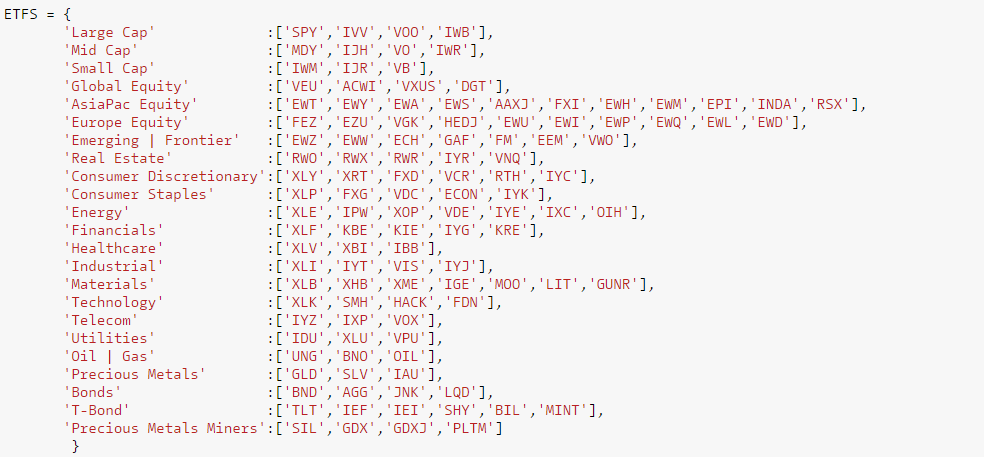
COMPOSITE ETF COMPONENTS:
LAST 252 TRADING DAYS

Click here for help understanding this chart

Click here for help understanding this chart

Click here for help understanding this chart

Click here for help understanding this chart
LAST 126 TRADING DAYS

Click here for help understanding this chart

Click here for help understanding this chart

Click here for help understanding this chart

Click here for help understanding this chart
YEAR-TO-DATE LAST 66 TRADING DAYS

Click here for help understanding this chart

Click here for help understanding this chart

Click here for help understanding this chart

Click here for help understanding this chart
LAST 21 TRADING DAYS

Click here for help understanding this chart

Click here for help understanding this chart

Click here for help understanding this chart

Click here for help understanding this chart
LAST 10 TRADING DAYS

Click here for help understanding this chart

Click here for help understanding this chart

Click here for help understanding this chart

Click here for help understanding this chart
Implied Cost of Capital Estimates:
To learn more about the Implied Cost of Capital see here.
CATEGORY AVERAGE ICC ESTIMATES
ALL ETF ICC ESTIMATES BY CATEGORY
Cumulative Return Tables:
Notable Observations and Trends:
- The Precious Metals Miners composite has exploded over the last 126 and 66 days gaining ~+33, ~+37% respectively. That nearly doubles the next best performer for L/126 days and is just over 2.5x the second best performer over L/66 days.
- Precious Metals + Miners finally took a breath over the last 21 days as they lost ~ -3% and ~-2% respectively.
- Healthcare looks interesting again. It has been the third worst performer L/252 days losing investors almost -20%. Looking at the Best/Worst line plot L/66 days, Healthcare returns appear to have formed a base. Performance is positive since mid February 2016. Healthcare was the top performer L/10 days gaining ~+5%.
- Telecom has notable potential tailwinds. On a momentum basis the Telecom composite has been a top 3 performer for the L/252, L/126, L/10 days. On a fundamental basis, the ICC's of IXP and VOX are both >7% putting them in the upper half of investor's expected returns, compared to all ETFs.