
FOR A DEEPER DIVE INTO ETF PERFORMANCE AND RELATIVE VALUE SUBSCRIBE TO THE ETF INTERNAL ANALYTICS PACKAGE HERE
LAYOUT (Organized by Time Period):
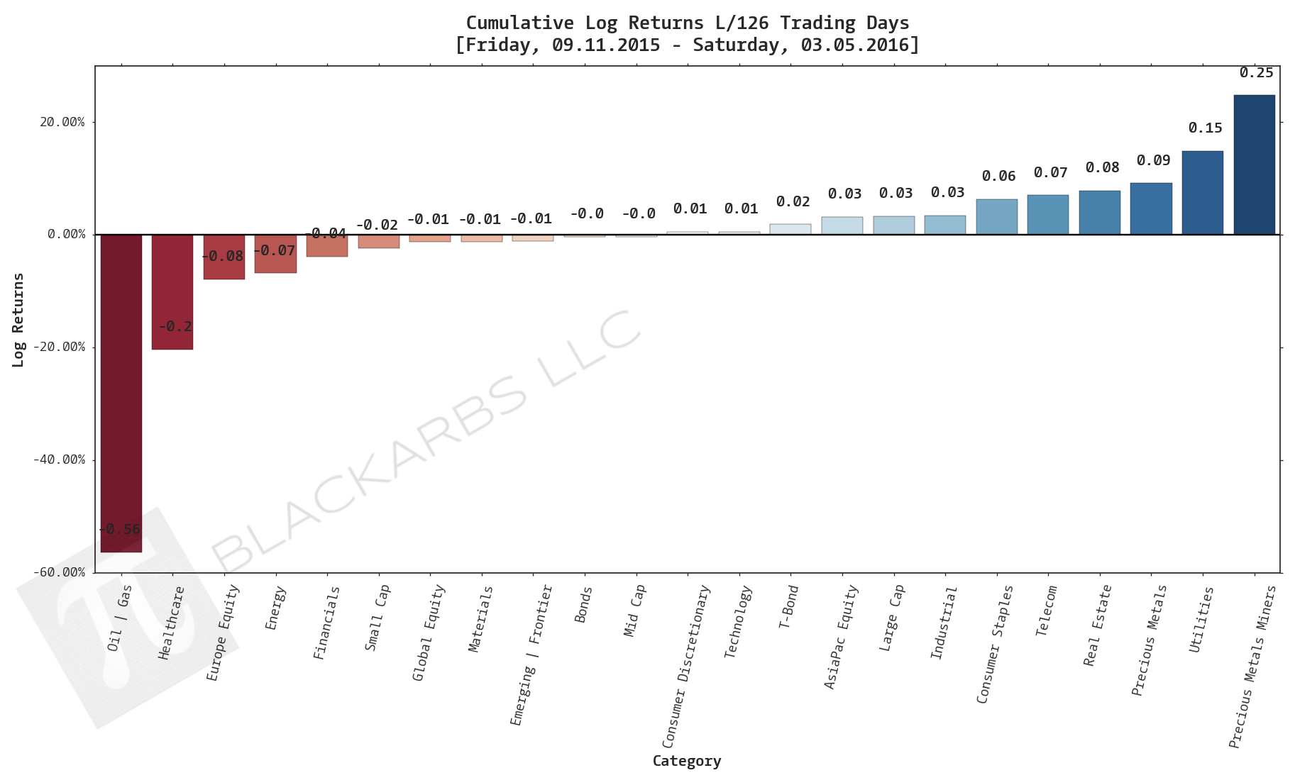
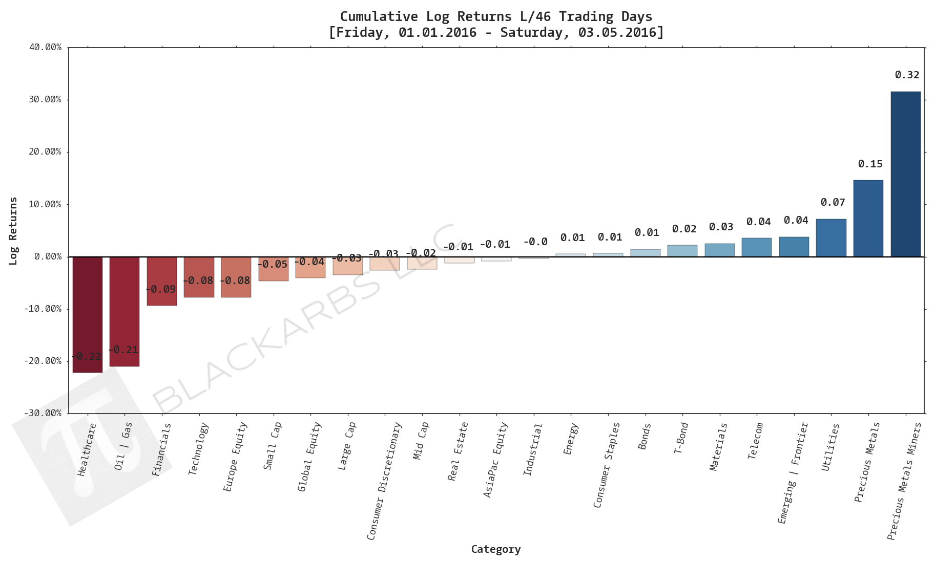
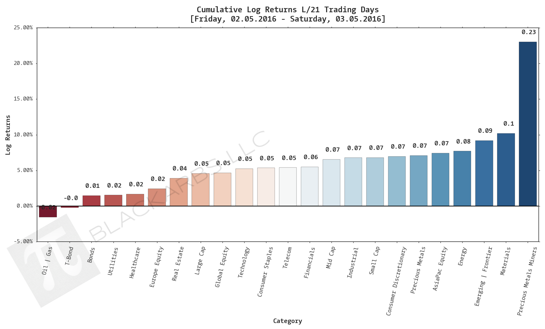
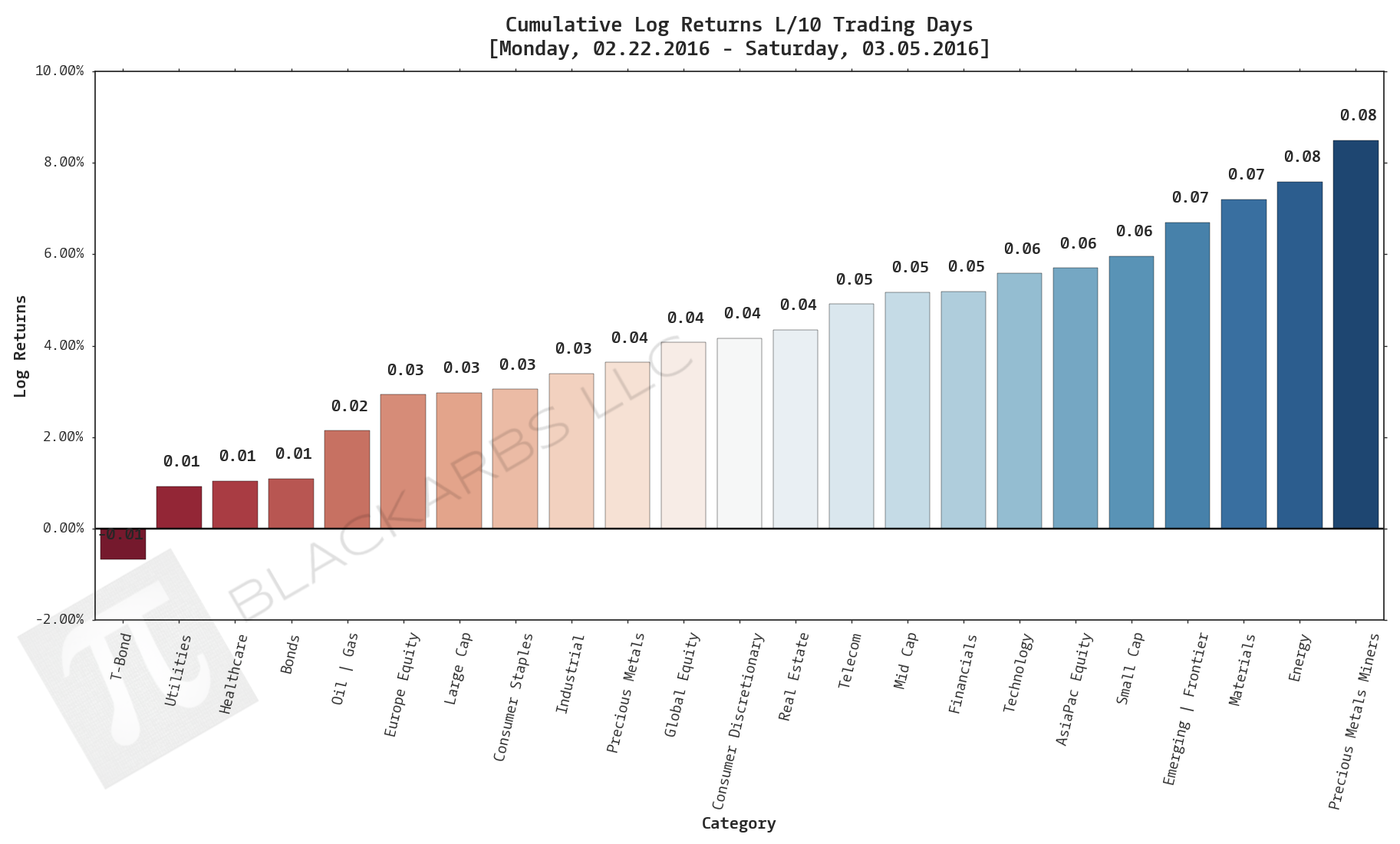
Composite ETF Cumulative Returns Momentum Bar plot
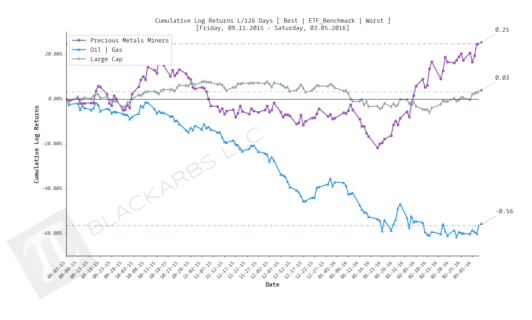
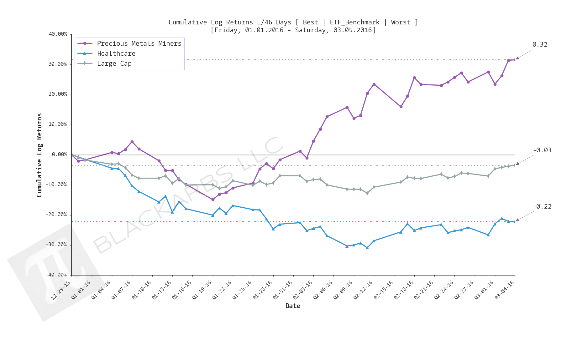
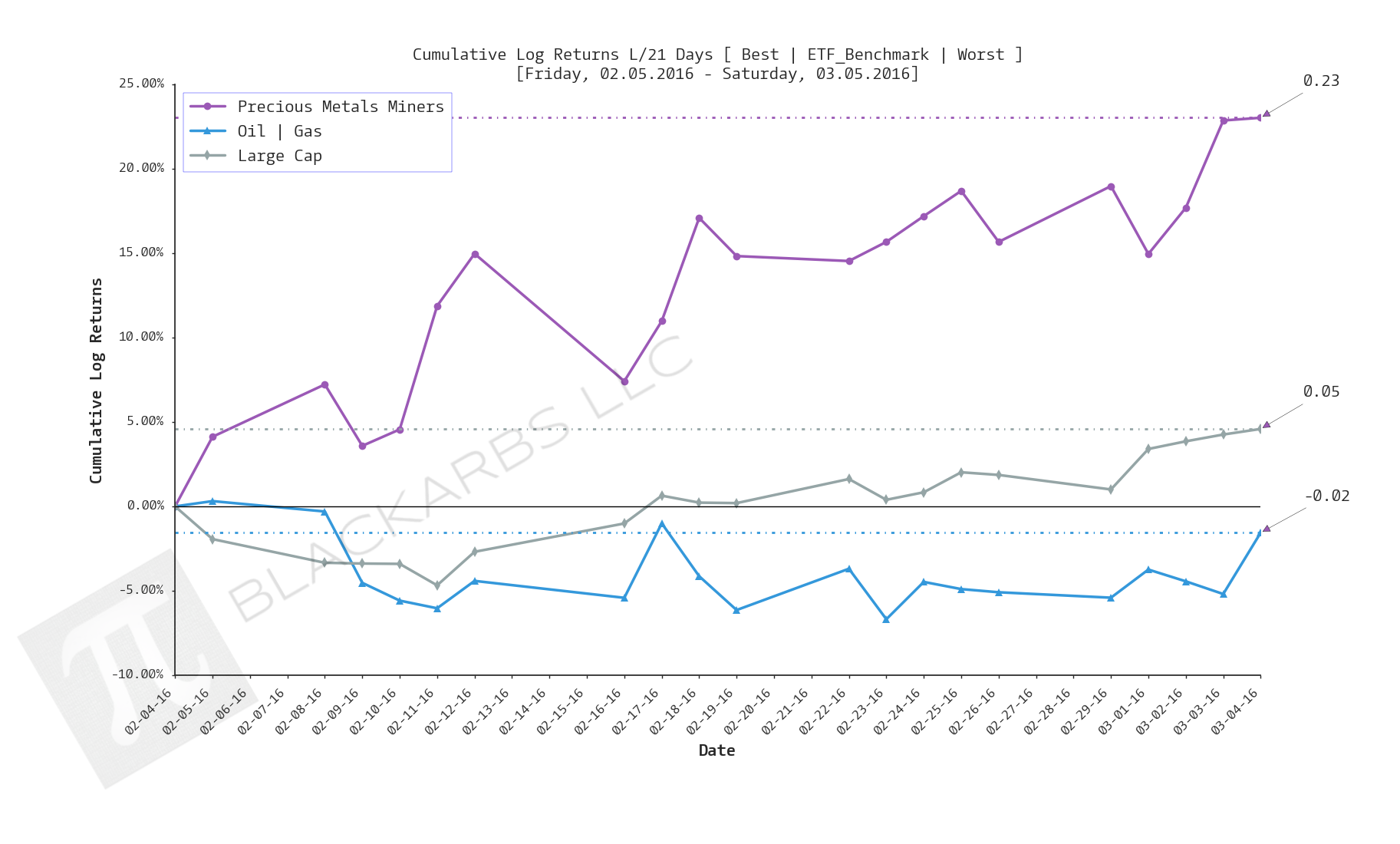
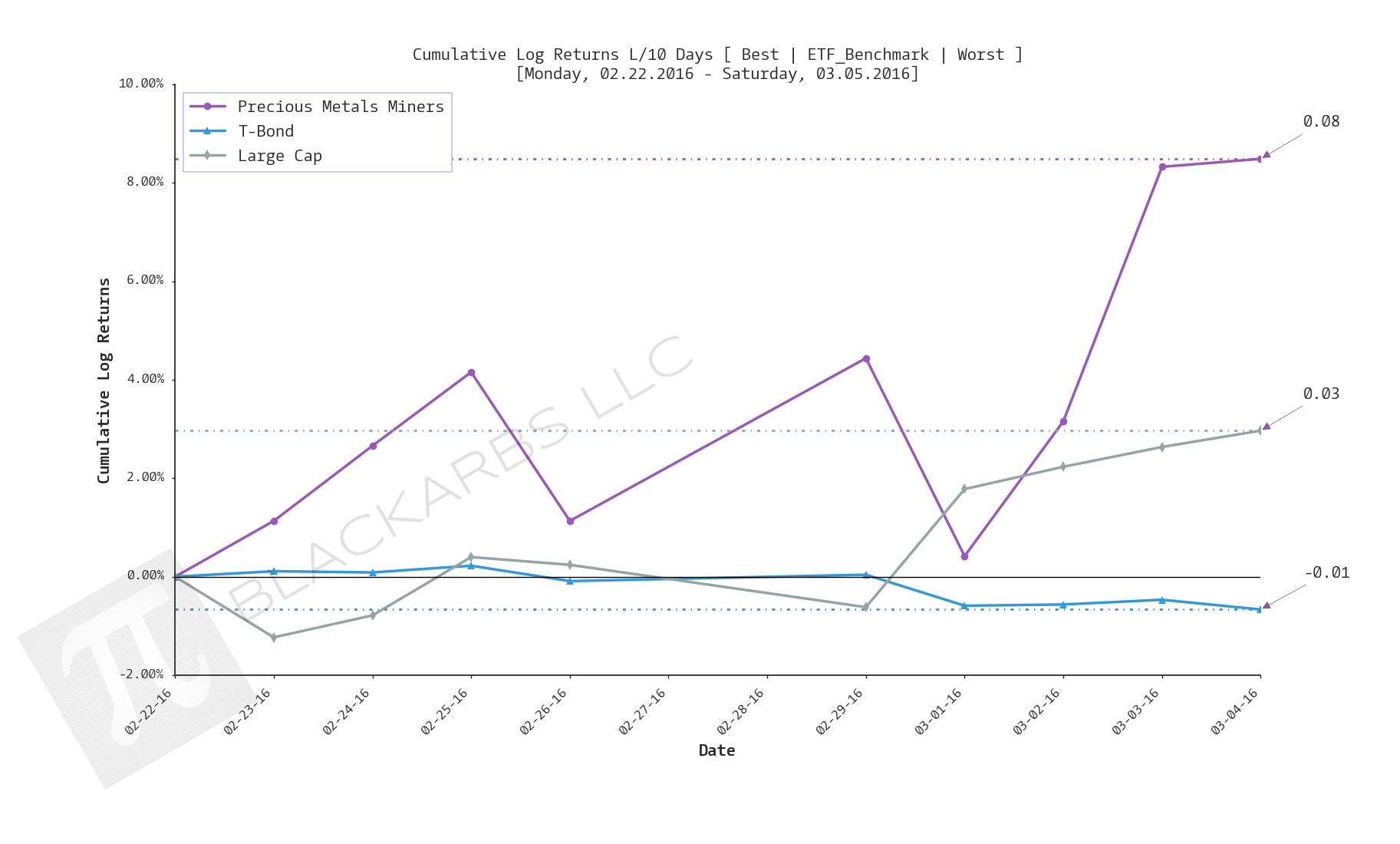
Composite ETF Cumulative Returns Line plot
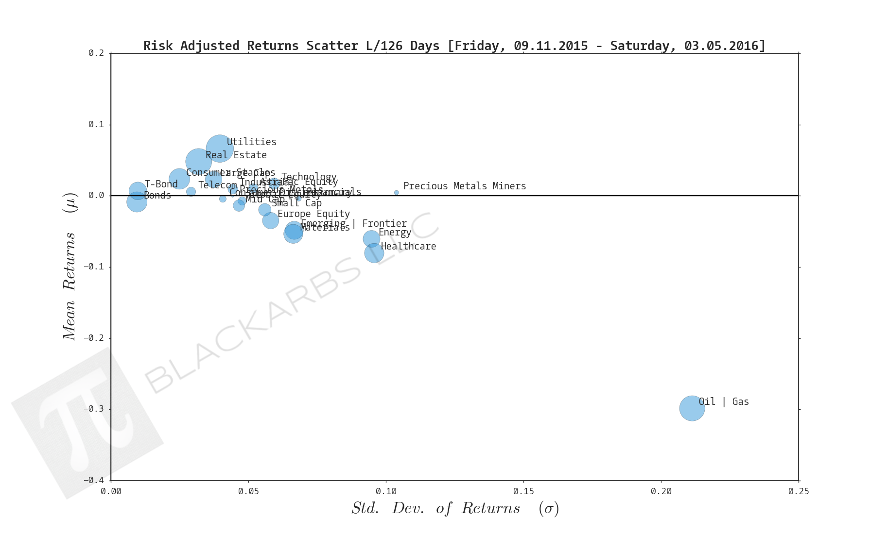
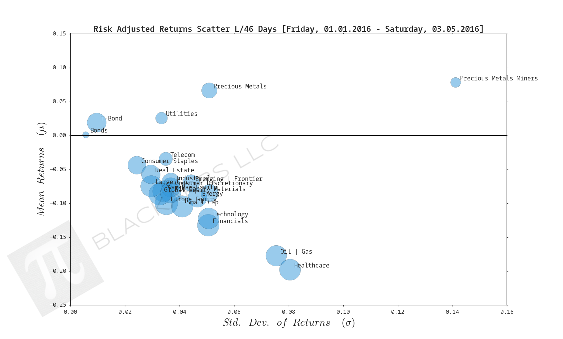
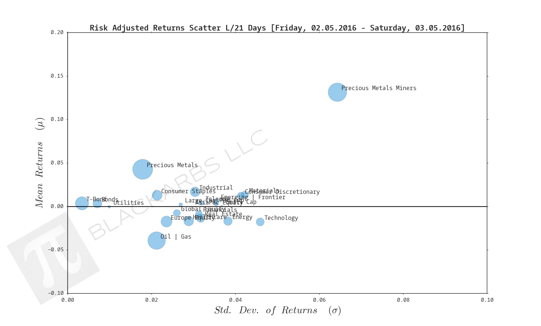
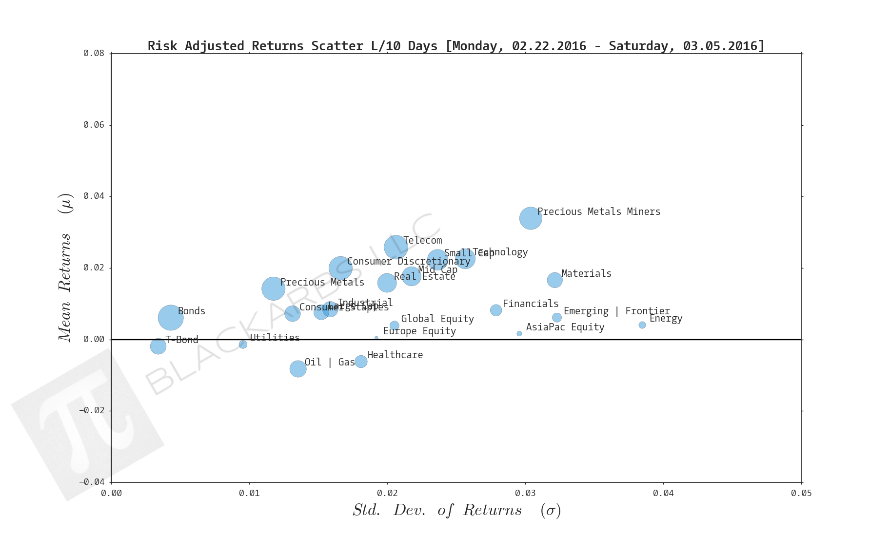
Composite ETF Risk-Adjusted Returns Scatter plot (Std vs Mean)
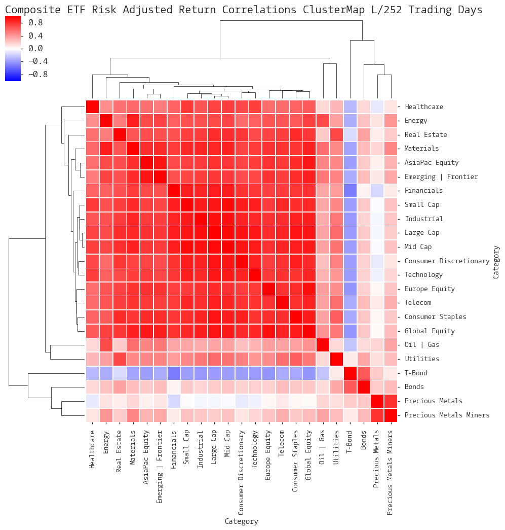
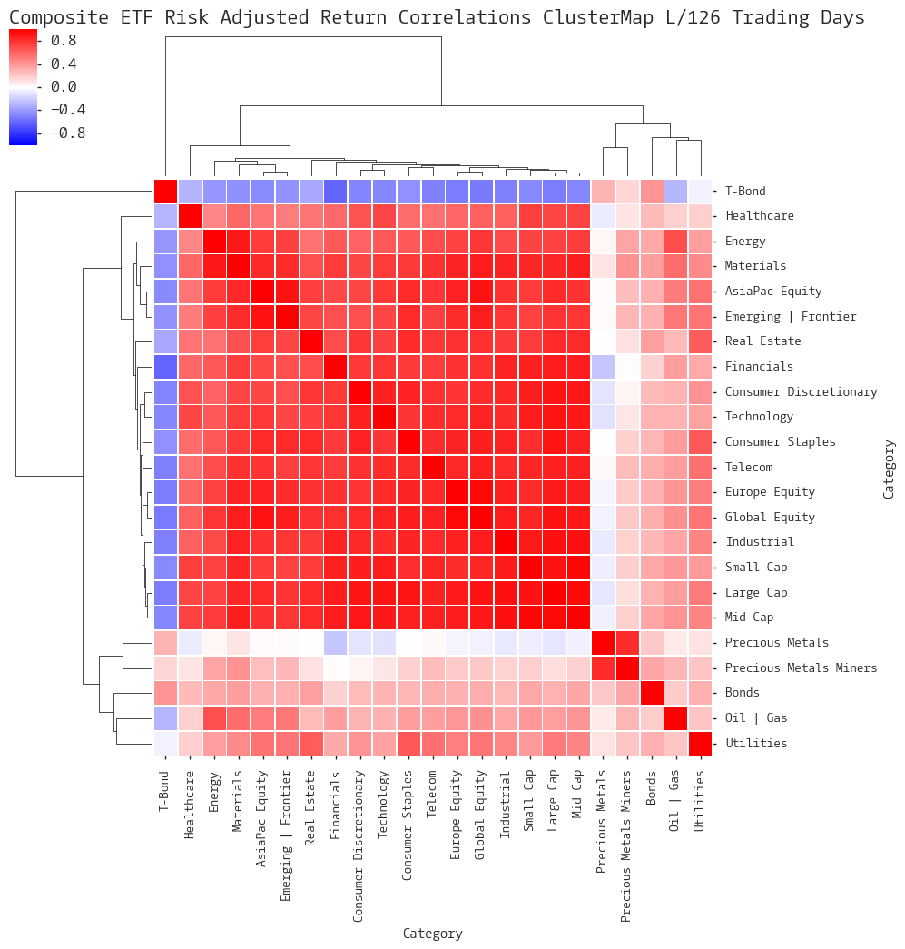
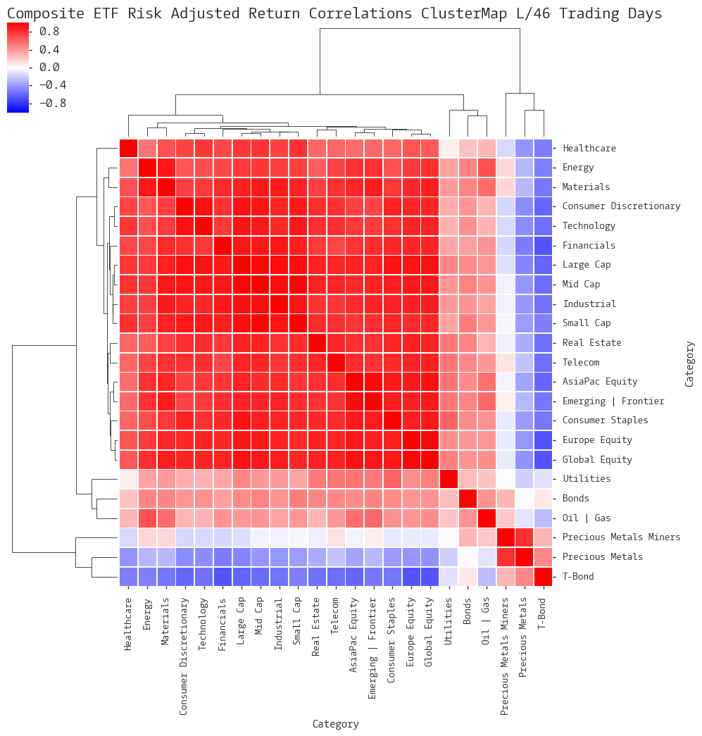
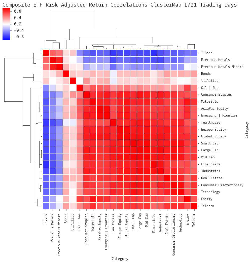
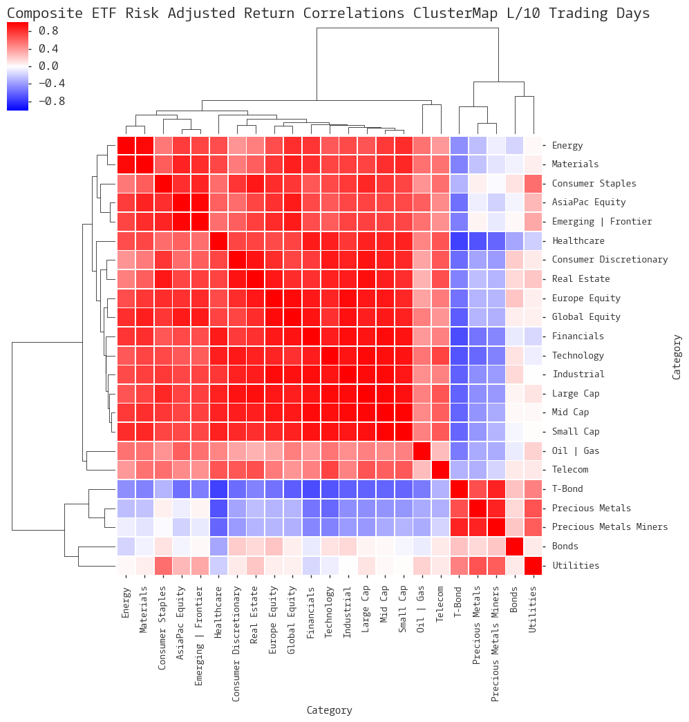
Composite ETF Risk-Adjusted Return Correlations Heatmap (Clusterplot)
Implied Cost of Capital Estimates
Composite ETF Cumulative Return Tables
Notable Trends and Observations
COMPOSITE ETF COMPONENTS:
Notable Trends and Observations
LAST 252 TRADING DAYS
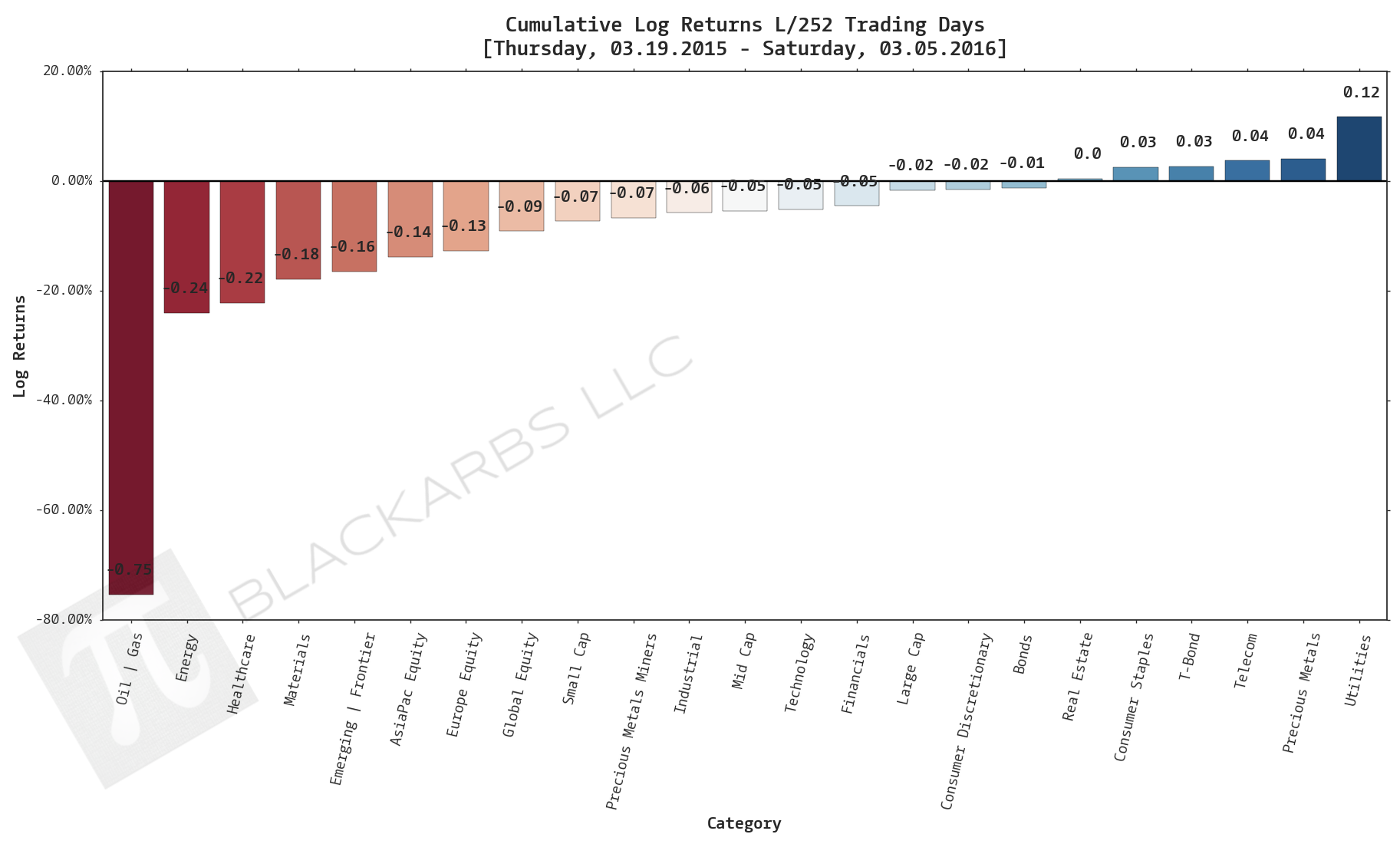
Click here for help understanding this chart
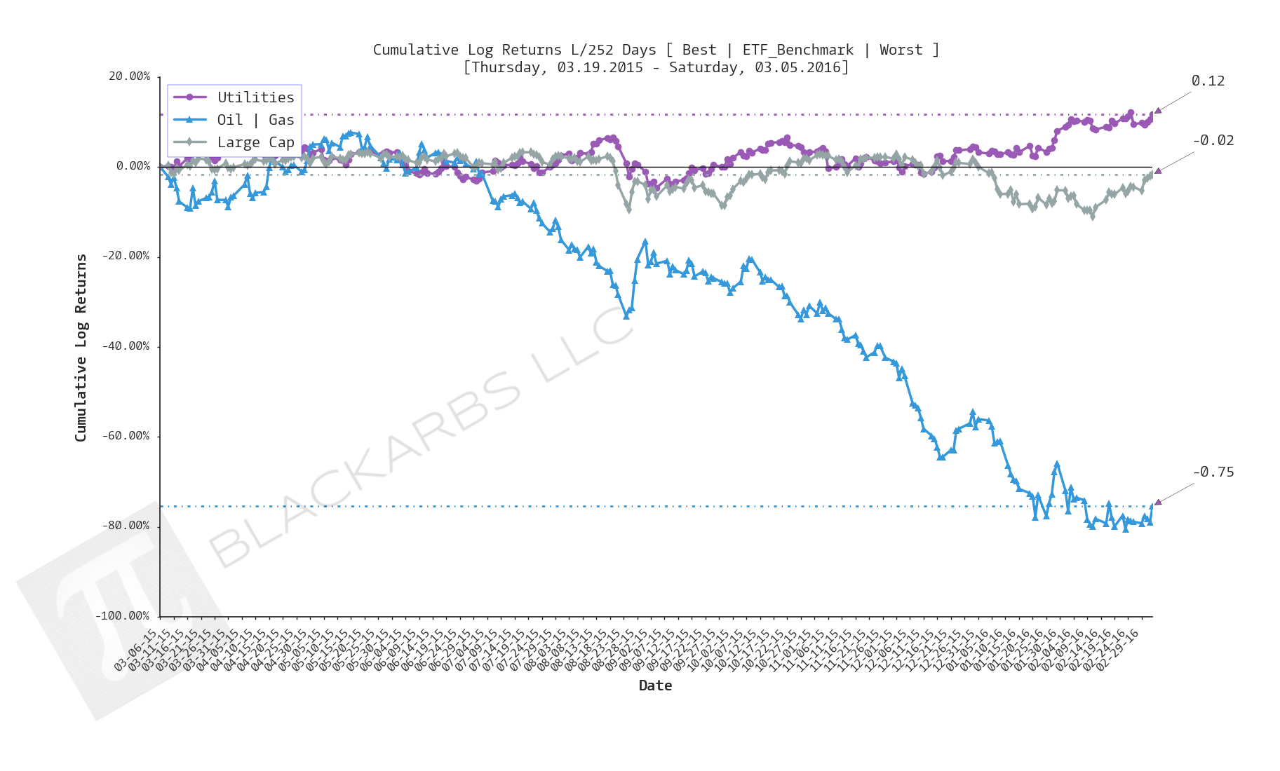
Click here for help understanding this chart
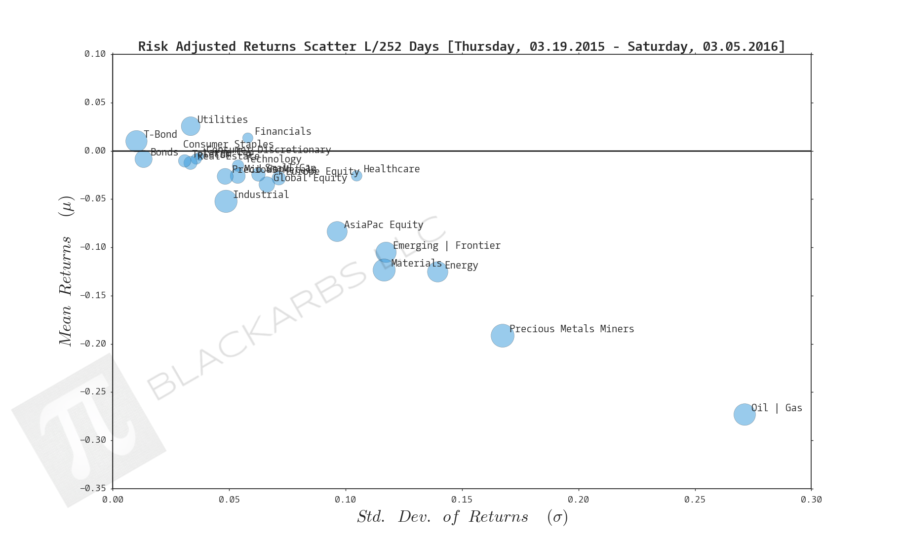
Click here for help understanding this chart
Click here for help understanding this chart
Last 126 trading days
Click here for help understanding this chart
Click here for help understanding this chart
Click here for help understanding this chart
Click here for help understanding this chart
year-to-date last 46 trading days
Click here for help understanding this chart
Click here for help understanding this chart
Click here for help understanding this chart
Click here for help understanding this chart
Last 21 trading days
Click here for help understanding this chart
Click here for help understanding this chart
Click here for help understanding this chart
Click here for help understanding this chart
last 10 trading days
Click here for help understanding this chart
Click here for help understanding this chart
Click here for help understanding this chart
Click here for help understanding this chart
Implied Cost of Capital Estimates:
To learn more about the Implied Cost of Capital see here.
CATEGORY AVERAGE ICC ESTIMATES
ALL ETF ICC ESTIMATES BY CATEGORY
Cumulative Return Tables:
Notable Observations and Trends:
- Precious Metals Miners (PMM) continue to dominate all other composites appearing as the number one outperformer several weeks in a row across multiple timeframes. This week the PMM composite is number one across the last 126 days through the last 10 days.
- Healthcare has continued to underperform this year and while it had positive returns over the last 10 days it was still a bottom 3 performer.
- The markets were "Risk-on" with with T-Bonds underperforming for the last 21 days while even the Oil and Gas composite rallied towards the end of the week and finally disappeared off the worst 3 performers list last 10 days.
- Are these bullish signs that risky assets will continue to gain, or is the market simply in a cyclical mean reversion regime where we should expect buying to be met by selling and selling to be met with more buying? The answer remains to be seen...