#block-yui_3_17_2_4_1455394346404_17847 .social-icons-style-border .sqs-svg-icon--wrapper { box-shadow: 0 0 0 2px inset; border: none; }
FOR A DEEPER DIVE INTO ETF PERFORMANCE AND RELATIVE VALUE SUBSCRIBE TO THE ETF INTERNAL ANALYTICS PACKAGE HERE
LAYOUT (Organized by Time Period):
Composite ETF Cumulative Returns Momentum Bar plot
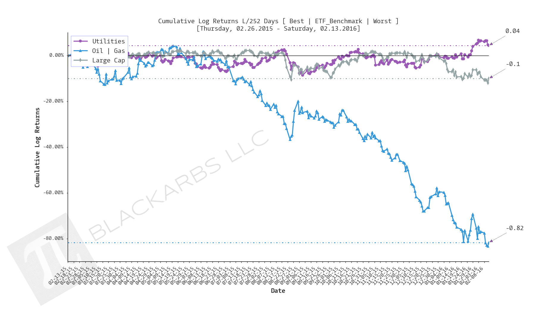
Composite ETF Cumulative Returns Line plot
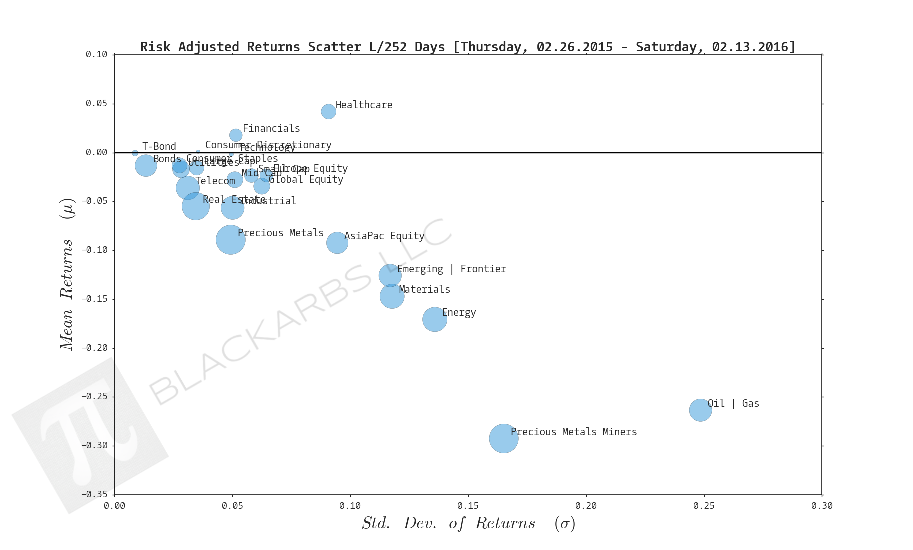
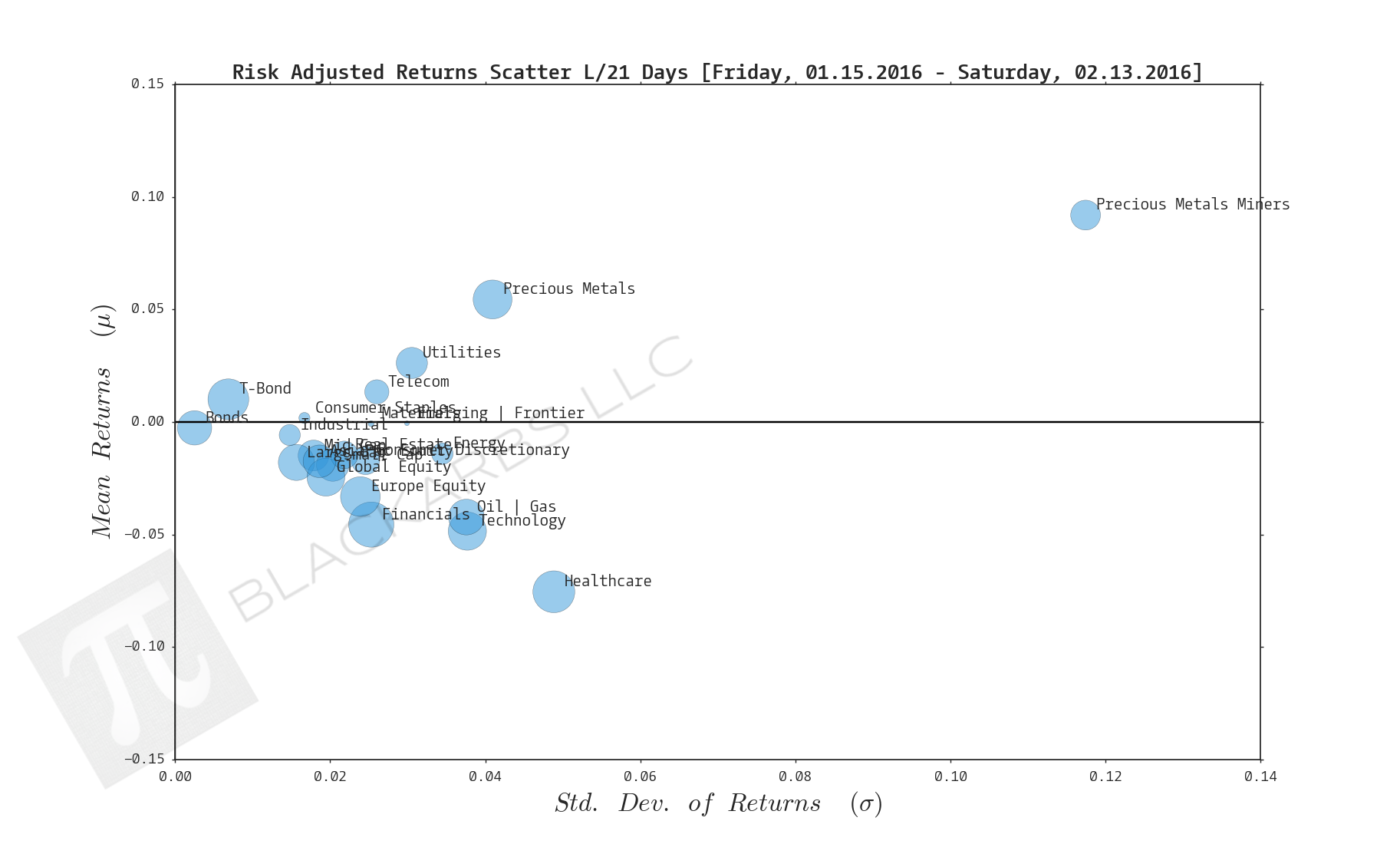
Composite ETF Risk-Adjusted Returns Scatter plot (Std vs Mean)
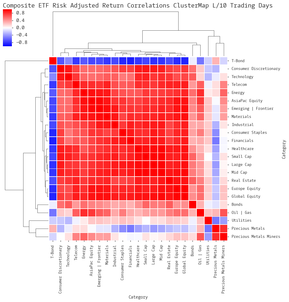
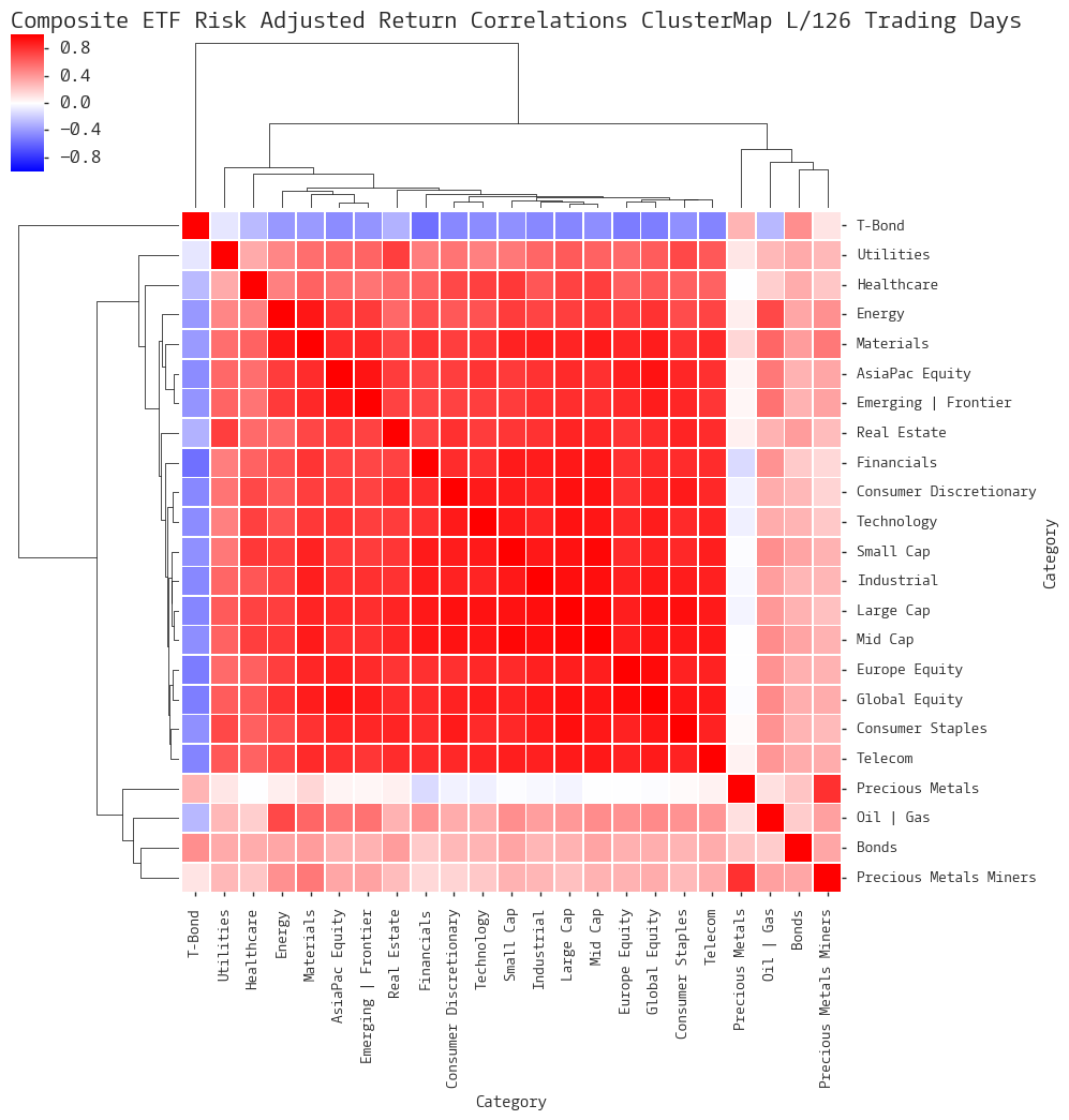
Composite ETF Risk-Adjusted Return Correlations Heatmap (Clusterplot)
Implied Cost of Capital Estimates
Composite ETF Cumulative Return Tables
Notable Trends and Observations
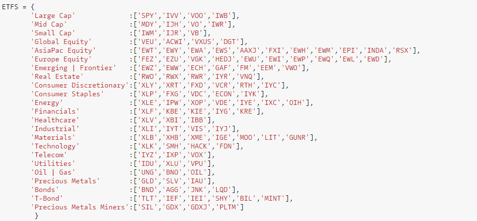
COMPOSITE ETF COMPONENTS:
LAST 252 TRADING DAYS

Click here for help understanding this chart
Click here for help understanding this chart
Click here for help understanding this chart

Click here for help understanding this chart
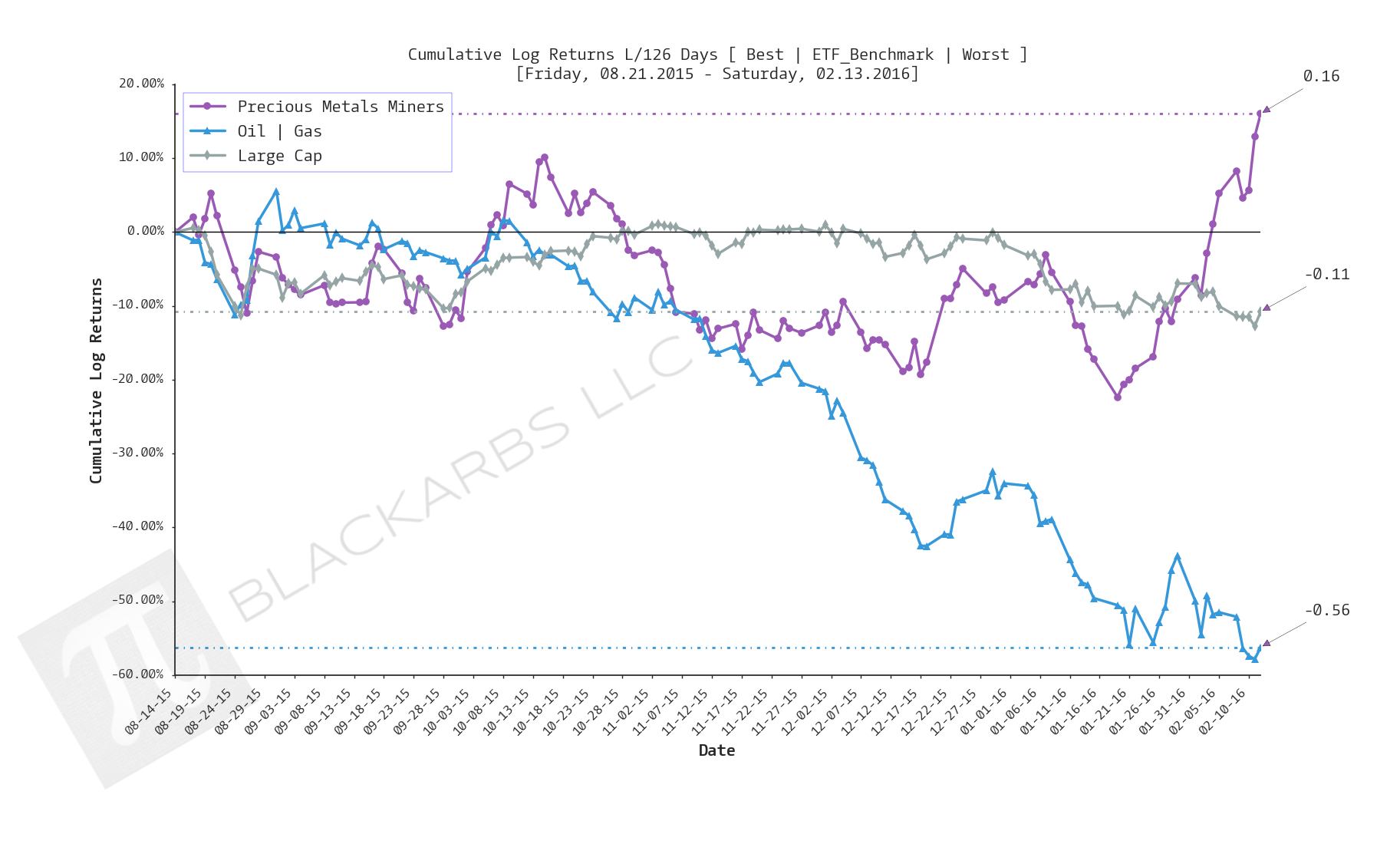
LAST 126 TRADING DAYS

Click here for help understanding this chart
Click here for help understanding this chart

Click here for help understanding this chart
Click here for help understanding this chart
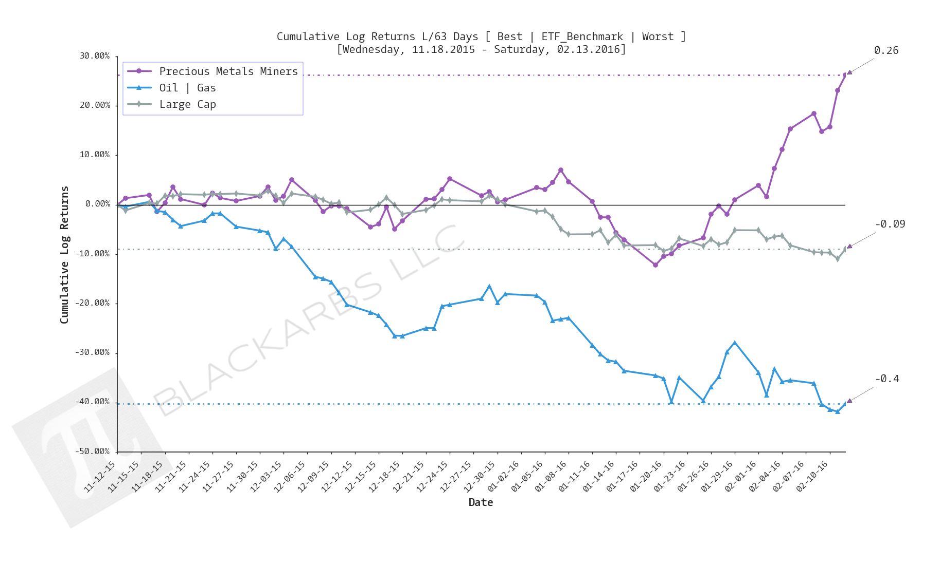
LAST 63 TRADING DAYS

Click here for help understanding this chart
Click here for help understanding this chart

Click here for help understanding this chart

Click here for help understanding this chart
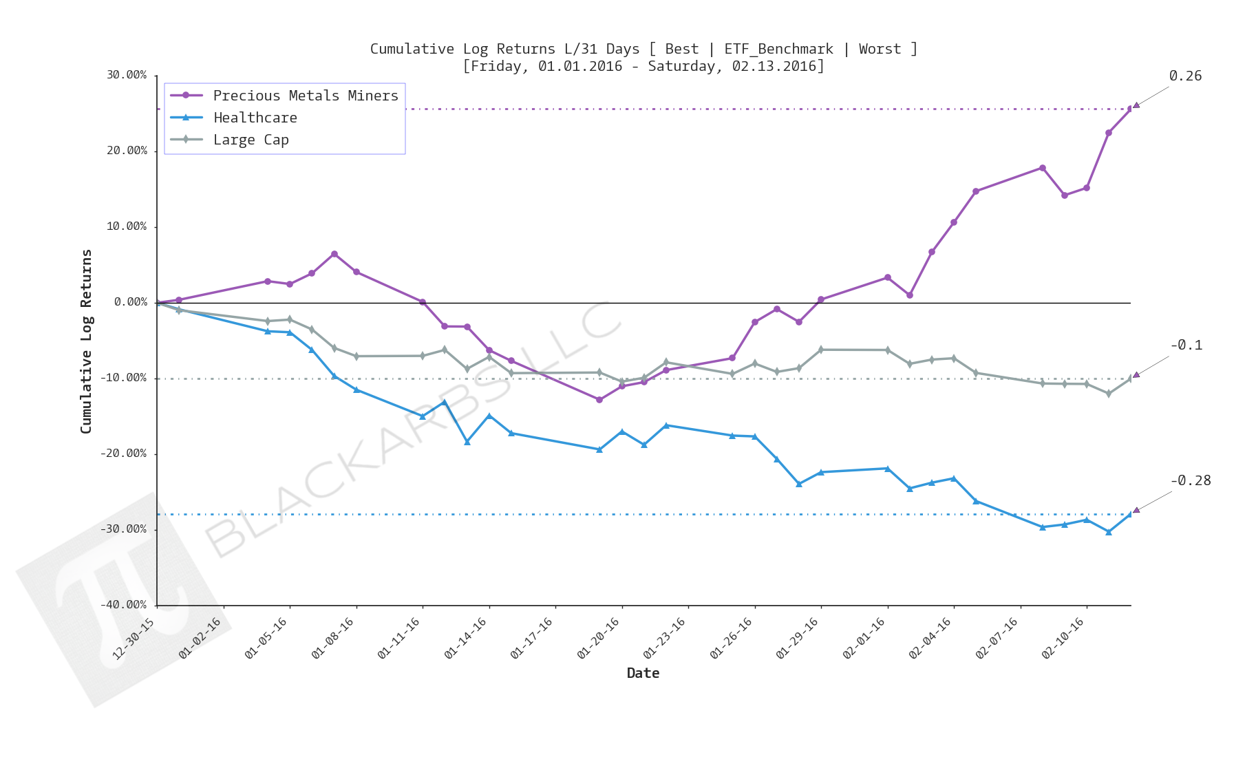
year-to-date LAST 31 TRADING DAYS

Click here for help understanding this chart
Click here for help understanding this chart

Click here for help understanding this chart

Click here for help understanding this chart
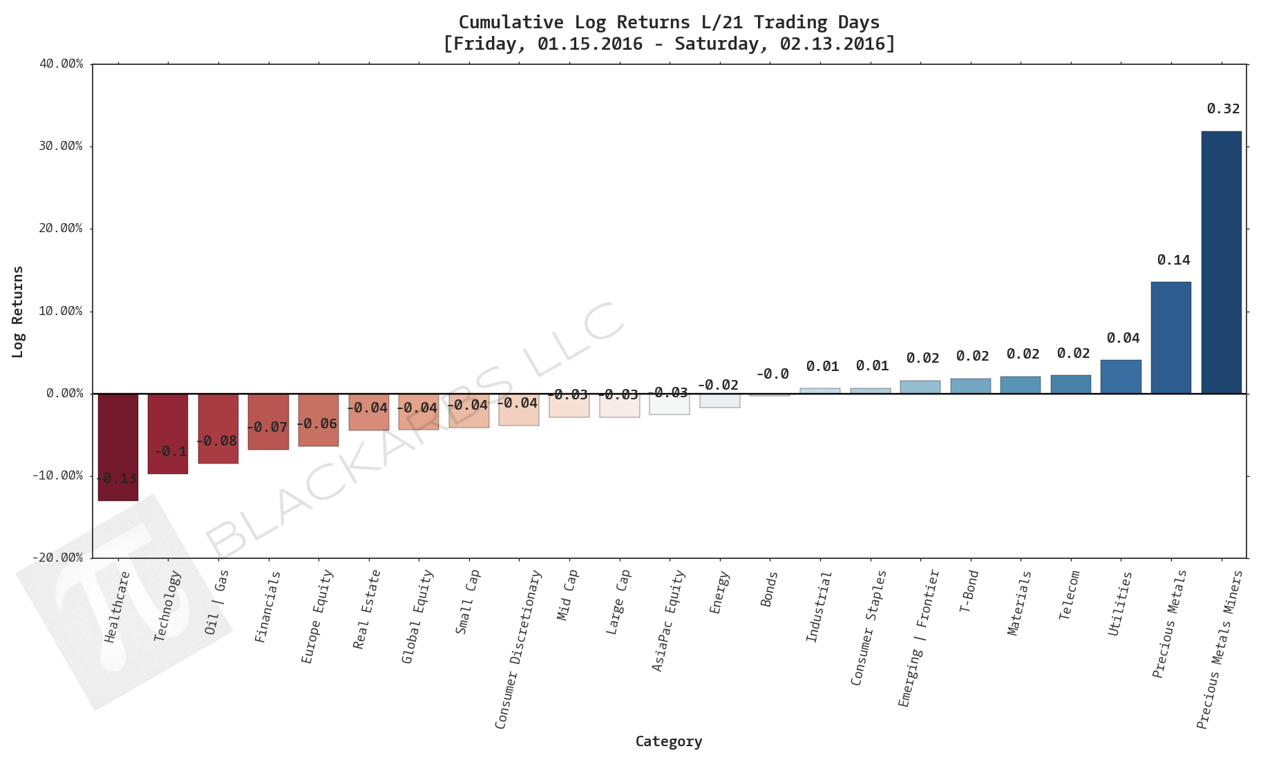
LAST 21 TRADING DAYS
Click here for help understanding this chart

Click here for help understanding this chart
Click here for help understanding this chart

Click here for help understanding this chart
LAST 10 TRADING DAYS

Click here for help understanding this chart

Click here for help understanding this chart

Click here for help understanding this chart

Click here for help understanding this chart
Implied Cost of Capital Estimates:
To learn more about the Implied Cost of Capital see here.
CATEGORY AVERAGE ICC ESTIMATES
ALL ETF ICC ESTIMATES BY CATEGORY
Cumulative Return Tables:
Notable Observations and Trends:
- Investors appear to be increasing their defensive positioning in the market as evidenced by the continued relative strength in the Precious Metals/Precious Metals Miners and Treasury Bond composites.
- Investors appear to be liquidating previous high performing asset classes as evidenced by Healthcare being among the bottom 3 performers off all composites across 5/6 timeframes beginning over the last 126 days.
- This is also supported by further deterioration in the relative performance of the Technology composite, which appears as a bottom 3 performer year-to-date.
- Correlations still appear relatively binary. However, a notable change is occurring in the correlation of Oil and Gas with the rest of the Sector based composites. It appears to be weakening year-to-date as compared to the last 126/252 trading days.
- The Treasury bond composite is seeing a notable increase in its negative correlation with the rest of the market as well. I look for this trend to continue as long as the global Negative-Interest Rate Policy trend continues. The US offers relatively high yield when compared to negative rates!