FOR A DEEPER DIVE INTO ETF PERFORMANCE AND RELATIVE VALUE SUBSCRIBE TO THE ETF INTERNAL ANALYTICS PACKAGE HERE
LAYOUT (Organized by Time Period):
Composite ETF Cumulative Returns Momentum Bar plot
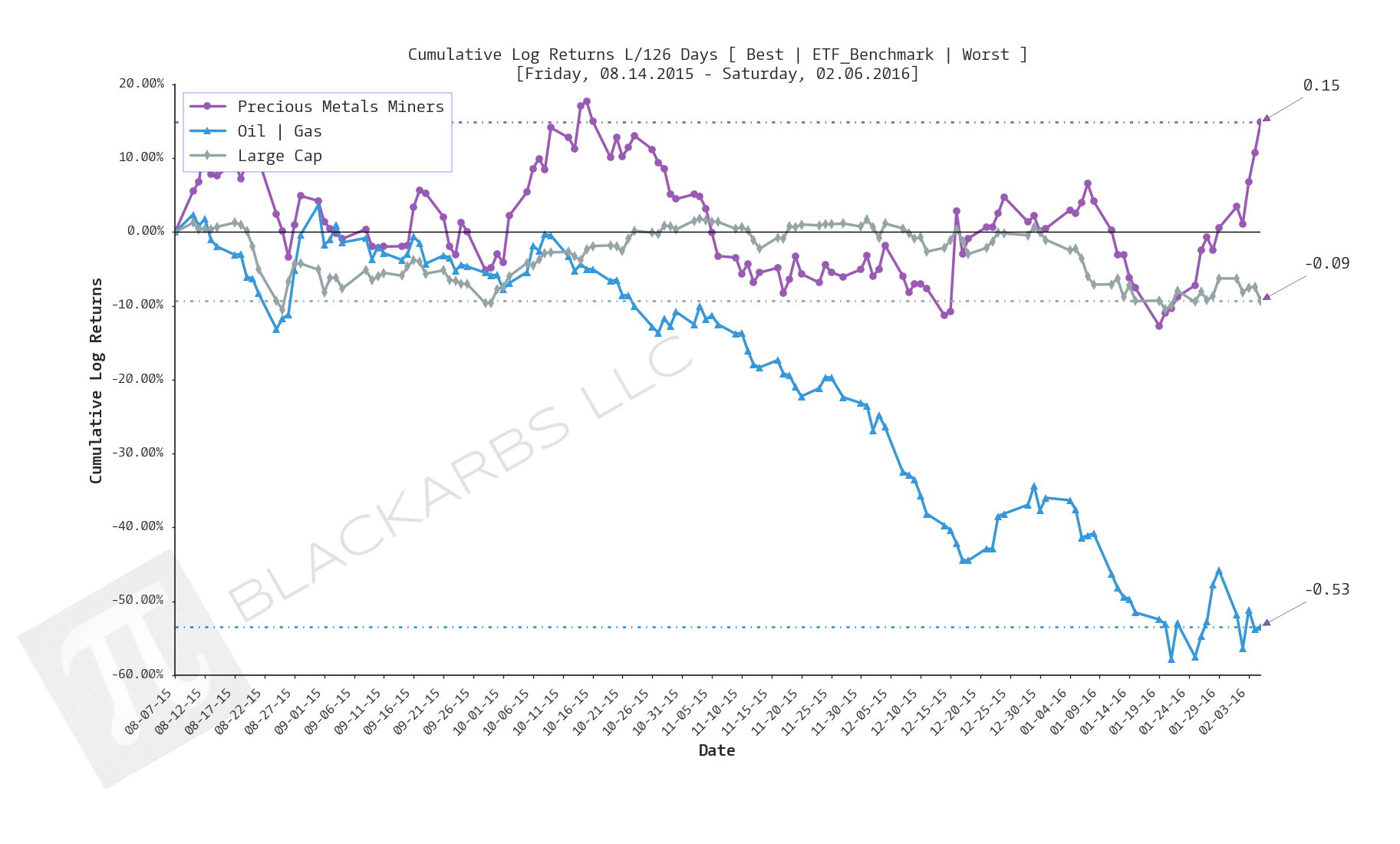
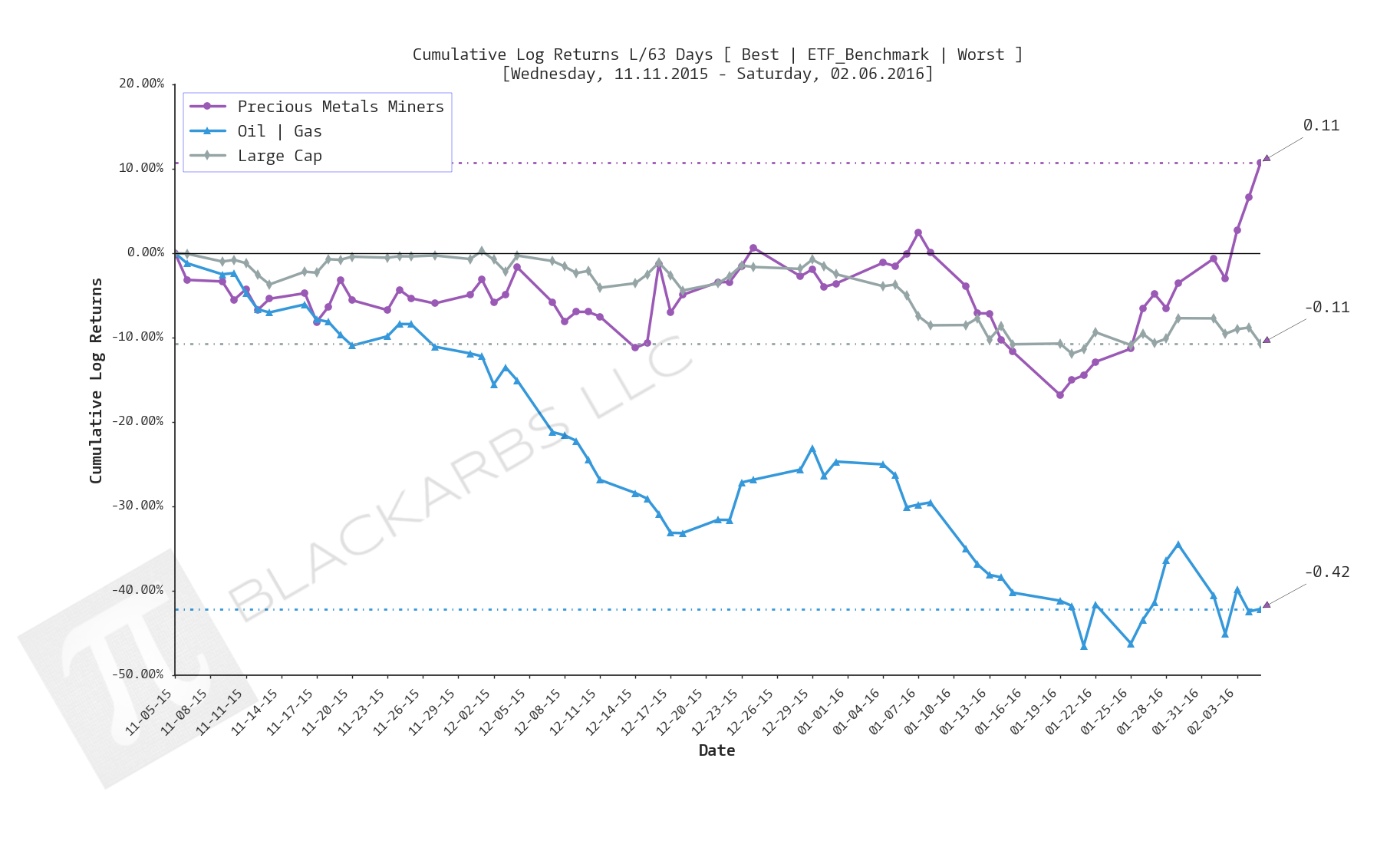
Composite ETF Cumulative Returns Line plot
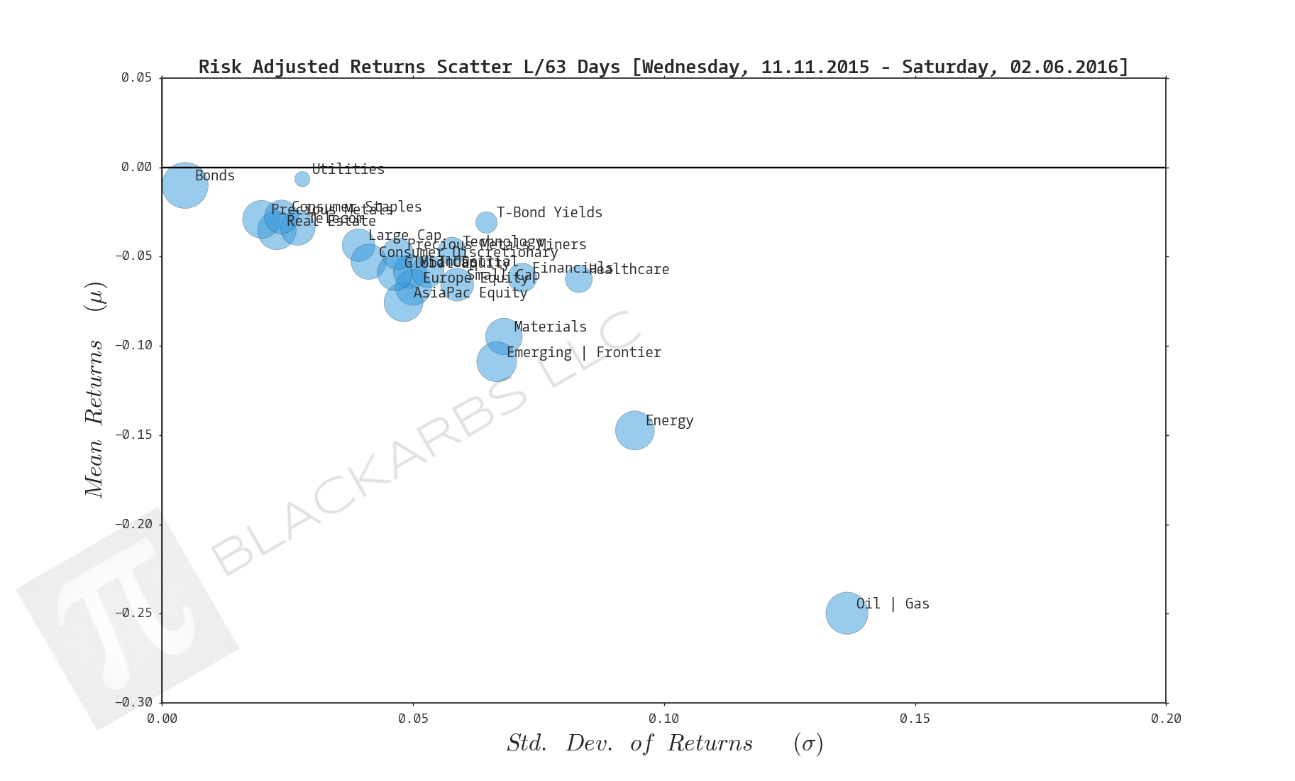
Composite ETF Risk-Adjusted Returns Scatter plot (Std vs Mean)
Composite ETF Risk-Adjusted Return Correlations Heatmap (Clusterplot)
Implied Cost of Capital Estimates
Composite ETF Cumulative Return Tables
Notable Trends and Observations
COMPOSITE ETF COMPONENTS:

LAST 252 TRADING DAYS

Click here for help understanding this chart

Click here for help understanding this chart

Click here for help understanding this chart

Click here for help understanding this chart
LAST 126 TRADING DAYS

Click here for help understanding this chart
Click here for help understanding this chart

Click here for help understanding this chart

Click here for help understanding this chart
LAST 63 TRADING DAYS

Click here for help understanding this chart
Click here for help understanding this chart

Click here for help understanding this chart

Click here for help understanding this chart
LAST 21 TRADING DAYS

Click here for help understanding this chart

Click here for help understanding this chart

Click here for help understanding this chart

Click here for help understanding this chart
LAST 10 TRADING DAYS

Click here for help understanding this chart

Click here for help understanding this chart

Click here for help understanding this chart

Click here for help understanding this chart
Implied Cost of Capital Estimates:
To learn more about the Implied Cost of Capital see here.
CATEGORY AVERAGE ICC ESTIMATES
ALL ETF ICC ESTIMATES BY CATEGORY
Cumulative Return Tables:
Notable Observations and Trends:
- Market crash risk is rising. What is currently a correction is showing the potential to become much worse.
- T-Bond Yields are the worst performers over the last 21 and 10 day periods. Recall that Bond yields and prices have an inverse relationship, meaning that Treasury Bonds are seeing a strong bid from the market.
- Precious Metal Miners and Precious Metals have been among the top 3 performers for 3 out of 5 time periods starting over the last 126 days. These composites are usually bid up as a form of crash protection when investors fear 1) systematic devaluation of the USD and other major currencies 2) global market crash.
- Utilities being among the top 3 performers across all time periods also support the rising crash risk that markets appear to be pricing in.