LAYOUT (Organized by Time Period):
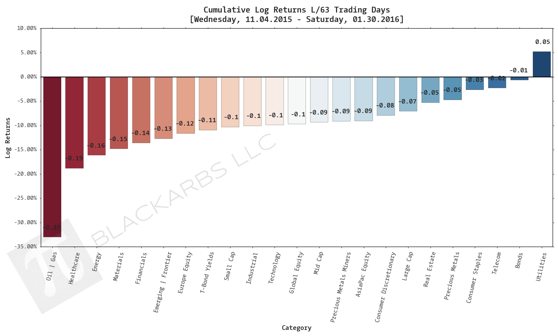
Composite ETF Cumulative Returns Momentum Bar plot
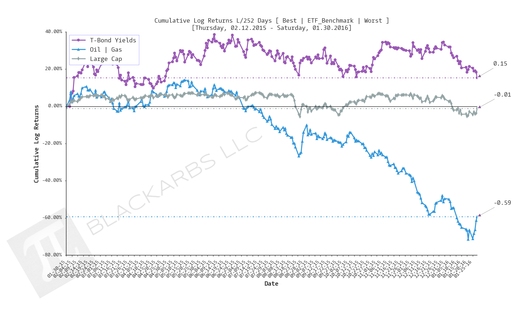
Composite ETF Cumulative Returns Line plot
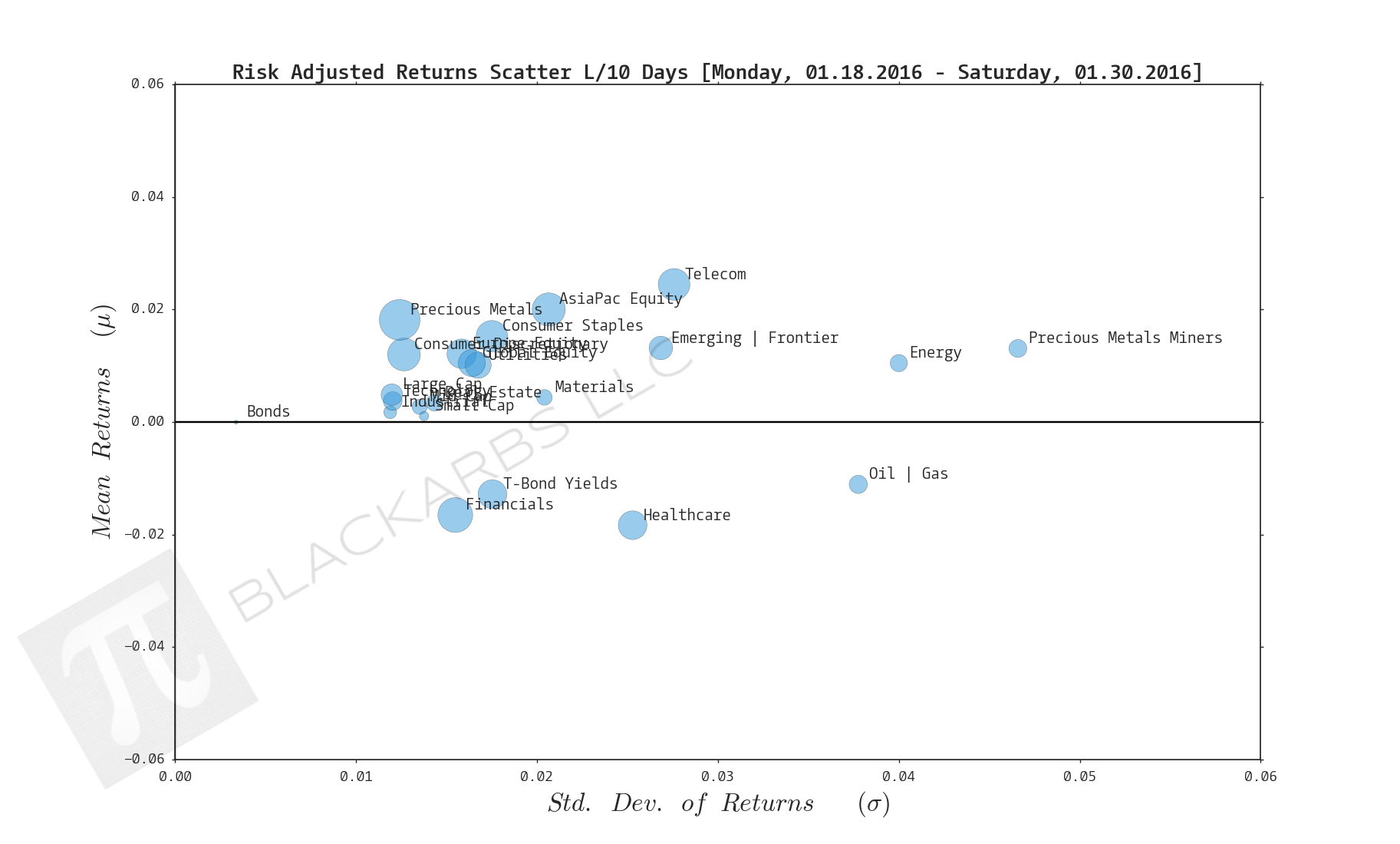
Composite ETF Risk-Adjusted Returns Scatter plot (Std vs Mean)
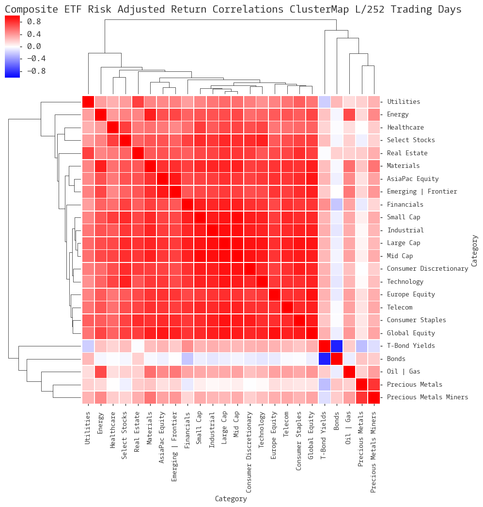
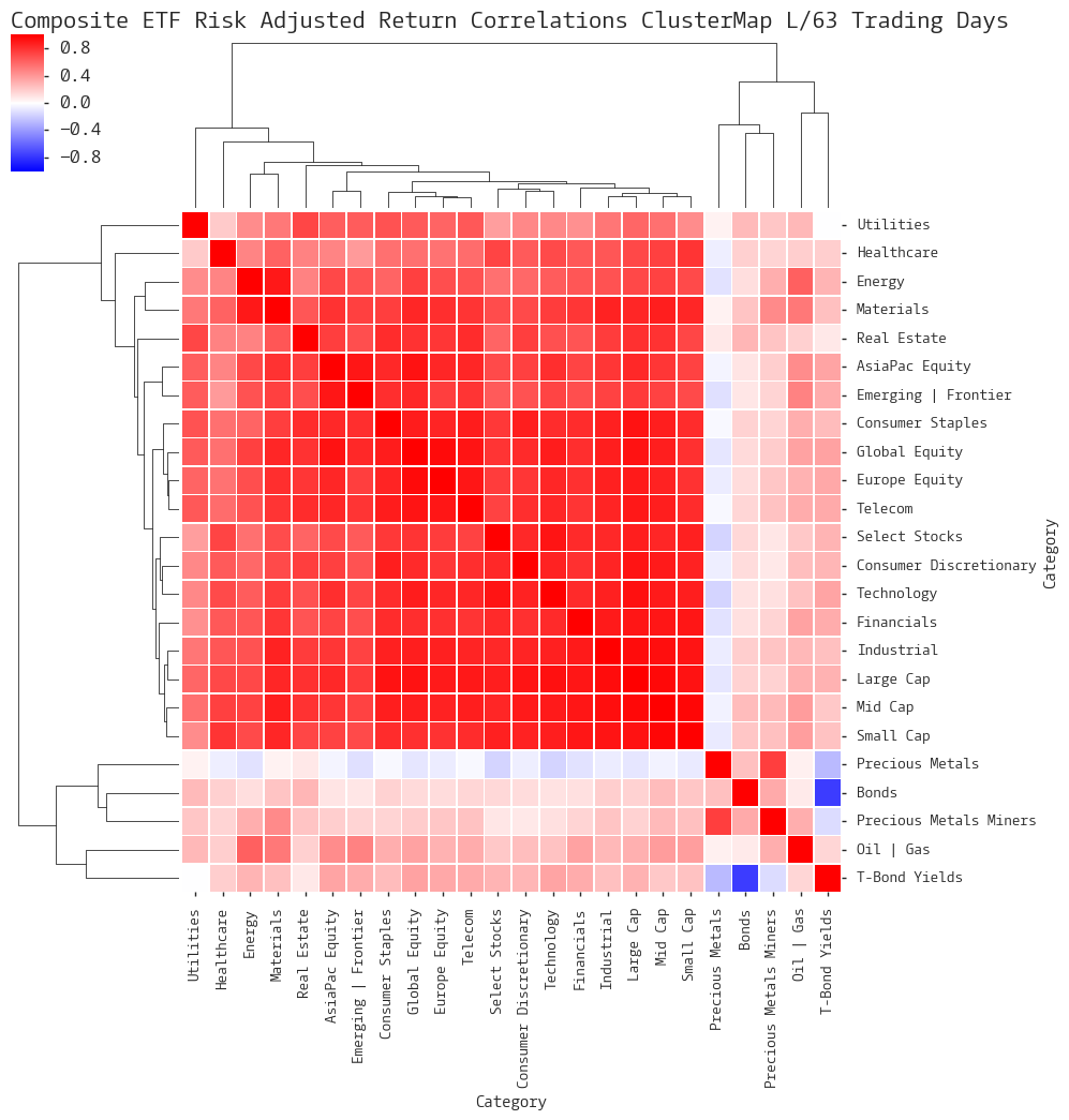
Composite ETF Risk-Adjusted Return Correlations Heatmap (Clusterplot)
Composite ETF Cumulative Return Tables
Notable Trends and Observations
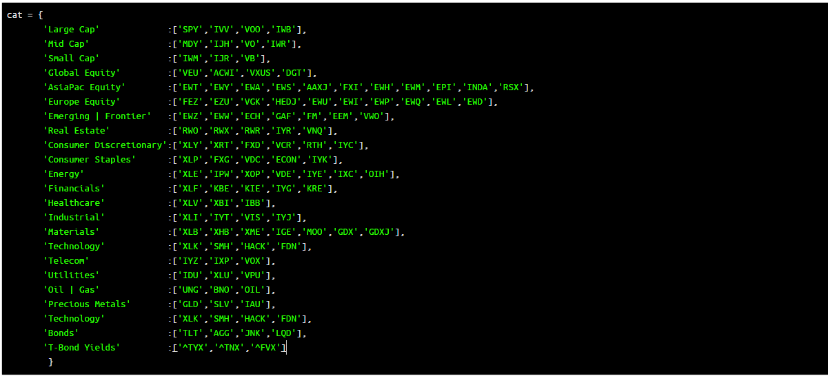
COMPOSITE ETF COMPONENTS:
LAST 252 TRADING DAYS

Click here for help understanding this chart
Click here for help understanding this chart

Click here for help understanding this chart
Click here for help understanding this chart
LAST 126 TRADING DAYS

Click here for help understanding this chart

Click here for help understanding this chart

Click here for help understanding this chart

Click here for help understanding this chart
LAST 63 TRADING DAYS
Click here for help understanding this chart

Click here for help understanding this chart

Click here for help understanding this chart
Click here for help understanding this chart
LAST 21 TRADING DAYS

Click here for help understanding this chart

Click here for help understanding this chart

Click here for help understanding this chart

Click here for help understanding this chart
LAST 10 TRADING DAYS

Click here for help understanding this chart

Click here for help understanding this chart

Click here for help understanding this chart

Click here for help understanding this chart
Cumulative Return Tables:
Notable Observations and Trends:
- Last 10 days provides strong evidence of a relief rally as all but 2 composites showed positive cumulative gains. Further evidence is the leadership group comprised of Energy, Precious Metals Miners, and Emerging/Frontier which had been heavily oversold on a long and medium term basis.
- Additionally over the Last 10 days one of the worst 3 performers (Bonds) had positive performance.
- Telecom has emerged as a composite to watch being one of the top 3 performers over the last 252 days. Perhaps it is the new safe haven asset class as it has been a top 5 performer on all time frames under study.
- Telecom has also been a strong performer on a risk-adjusted basis seemingly hugging the belly of the efficient frontier, near or above zero, across all time frames.