LAYOUT (Organized by Time Period):
Composite ETF Cumulative Returns Momentum Bar plot
Composite ETF Cumulative Returns Line plot
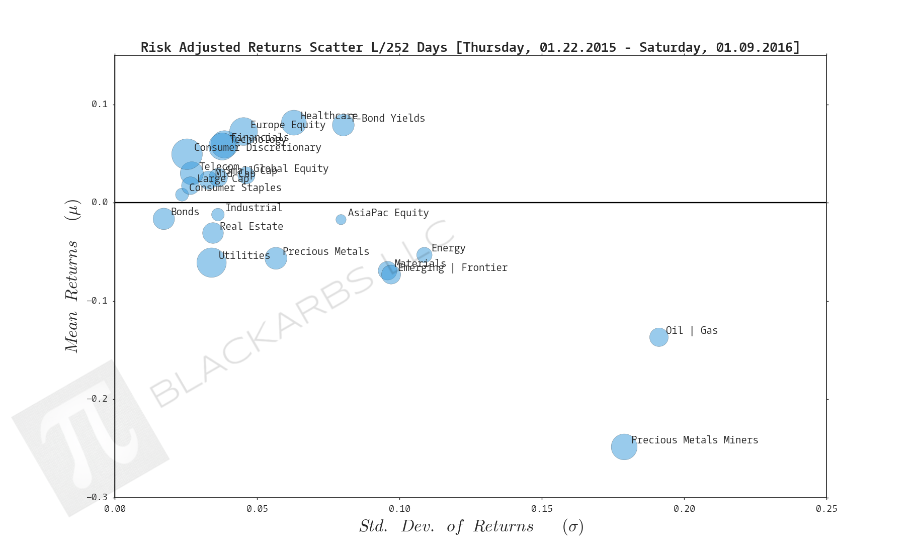
Composite ETF Risk-Adjusted Returns Scatter plot (Std vs Mean)
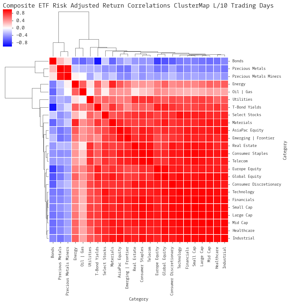
Composite ETF Risk-Adjusted Return Correlations Heatmap (Clusterplot)
Composite ETF Cumulative Return Tables
Notable Trends and Observations
COMPOSITE ETF COMPONENTS:

LAST 252 TRADING DAYS

Click here for help understanding this chart

Click here for help understanding this chart
Click here for help understanding this chart

Click here for help understanding this chart
LAST 126 TRADING DAYS

Click here for help understanding this chart

Click here for help understanding this chart

Click here for help understanding this chart

Click here for help understanding this chart
LAST 63 TRADING DAYS

Click here for help understanding this chart

Click here for help understanding this chart

Click here for help understanding this chart

Click here for help understanding this chart
LAST 21 TRADING DAYS

Click here for help understanding this chart

Click here for help understanding this chart

Click here for help understanding this chart

Click here for help understanding this chart
LAST 10 TRADING DAYS

Click here for help understanding this chart

Click here for help understanding this chart

Click here for help understanding this chart

Click here for help understanding this chart
Cumulative Return Tables:
Notable Observations and Trends:
- It was a bloodbath in global markets to start 2016 with only 2 of the 23 composites registering gains over the last 10 days.
- Risk off was in full force as Precious Metals, Bonds and Precious Metals Miners all gained over the last week (not shown) but were top performers over the last 10 days.
- There was precious little diversification offered across the composites during this selloff. Looking at the Risk-Adjusted Correlations Heatmap, the intensity of the red and the intensity of the blue suggest a very binary approach by investors. Again, Bonds, Precious Metals and Precious Metals Miners were the only composites providing any diversification benefits.
- It's unsurprising that, as market internals have weakened, we would see previous market leading sectors getting hit the hardest as investors lock in gains and reduce risk. (Technology, Healthcare)