LAYOUT (Organized by Time Period):
Composite ETF Cumulative Returns Momentum Bar plot
Composite ETF Cumulative Returns Line plot
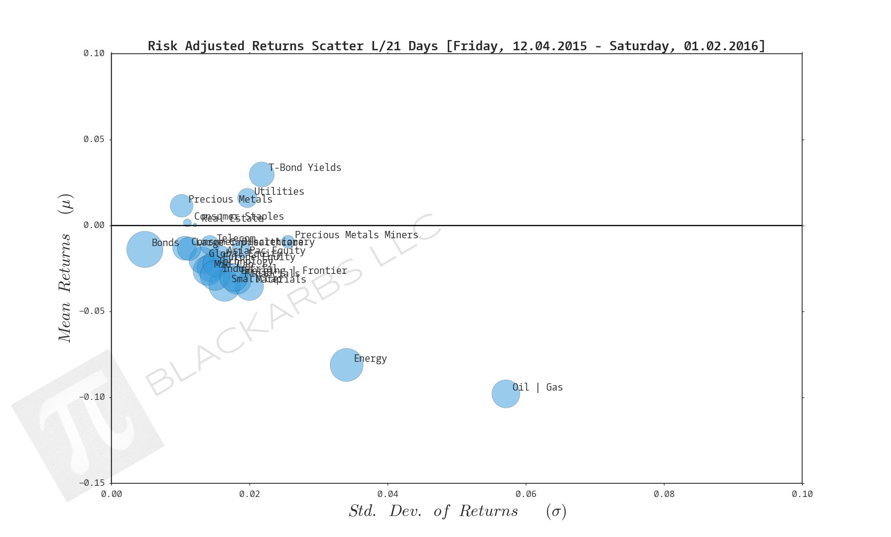
Composite ETF Risk-Adjusted Returns Scatter plot (Std vs Mean)
Composite ETF Risk-Adjusted Return Correlations Heatmap (Clusterplot)
Composite ETF Cumulative Return Tables
Notable Trends and Observations
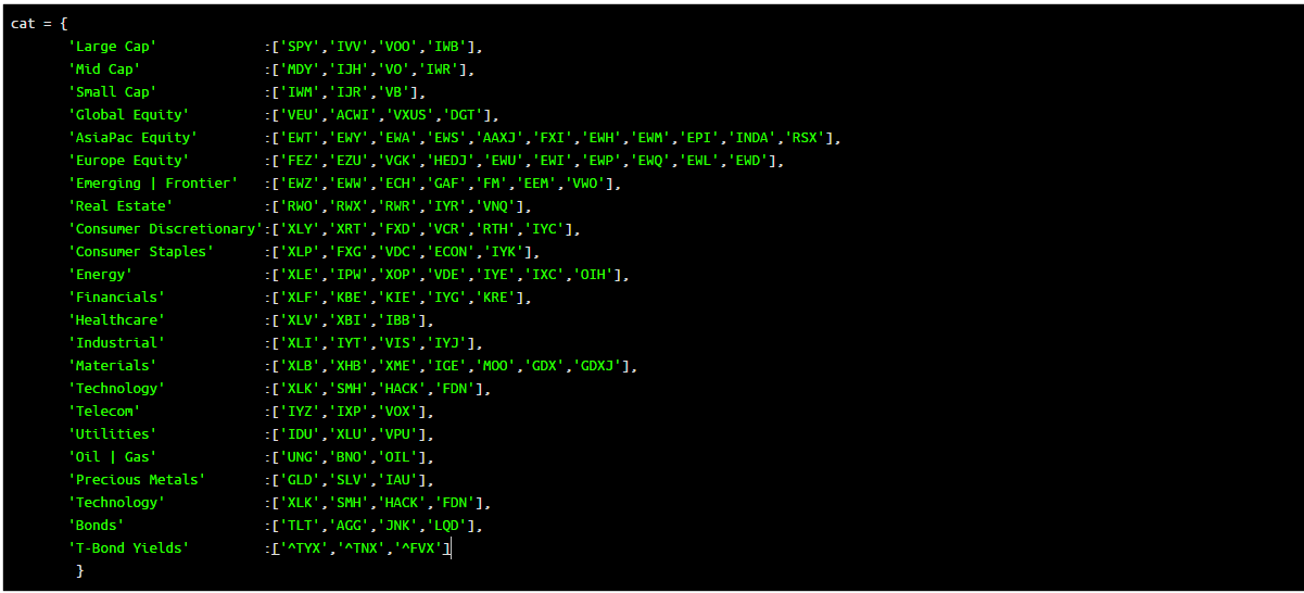
COMPOSITE ETF COMPONENTS:
LAST 252 TRADING DAYS

Click here for help understanding this chart

Click here for help understanding this chart

Click here for help understanding this chart

Click here for help understanding this chart
LAST 126 TRADING DAYS

Click here for help understanding this chart

Click here for help understanding this chart

Click here for help understanding this chart

Click here for help understanding this chart
LAST 63 TRADING DAYS

Click here for help understanding this chart

Click here for help understanding this chart

Click here for help understanding this chart

Click here for help understanding this chart
LAST 21 TRADING DAYS

Click here for help understanding this chart

Click here for help understanding this chart

Click here for help understanding this chart

Click here for help understanding this chart
LAST 10 TRADING DAYS

Click here for help understanding this chart

Click here for help understanding this chart

Click here for help understanding this chart

Click here for help understanding this chart
Cumulative Return Tables:
Notable Observations and Trends:
- T-Bond Yields have positive cumulative returns on all time frames. This appears to be a one way trade given the prior belief and subsequent start of rate tightening by the Federal Reserve.
- As noted last week, Oil + Gas and Precious Metals Miners may be experiencing a bit of a relief rally as traders/investors cash in on their short plays and/or try to time a bottom.
- Examining the Scatter plots over the last 252 days Healthcare is the best risk-adjusted composite and it's not even close.
- Interesting to note the Small Caps composite makes an appearance on the bottom 3 worst performers over the last 21 days.