LAYOUT (Organized by Time Period):
Composite ETF Cumulative Returns Momentum Bar plot
Composite ETF Cumulative Returns Line plot
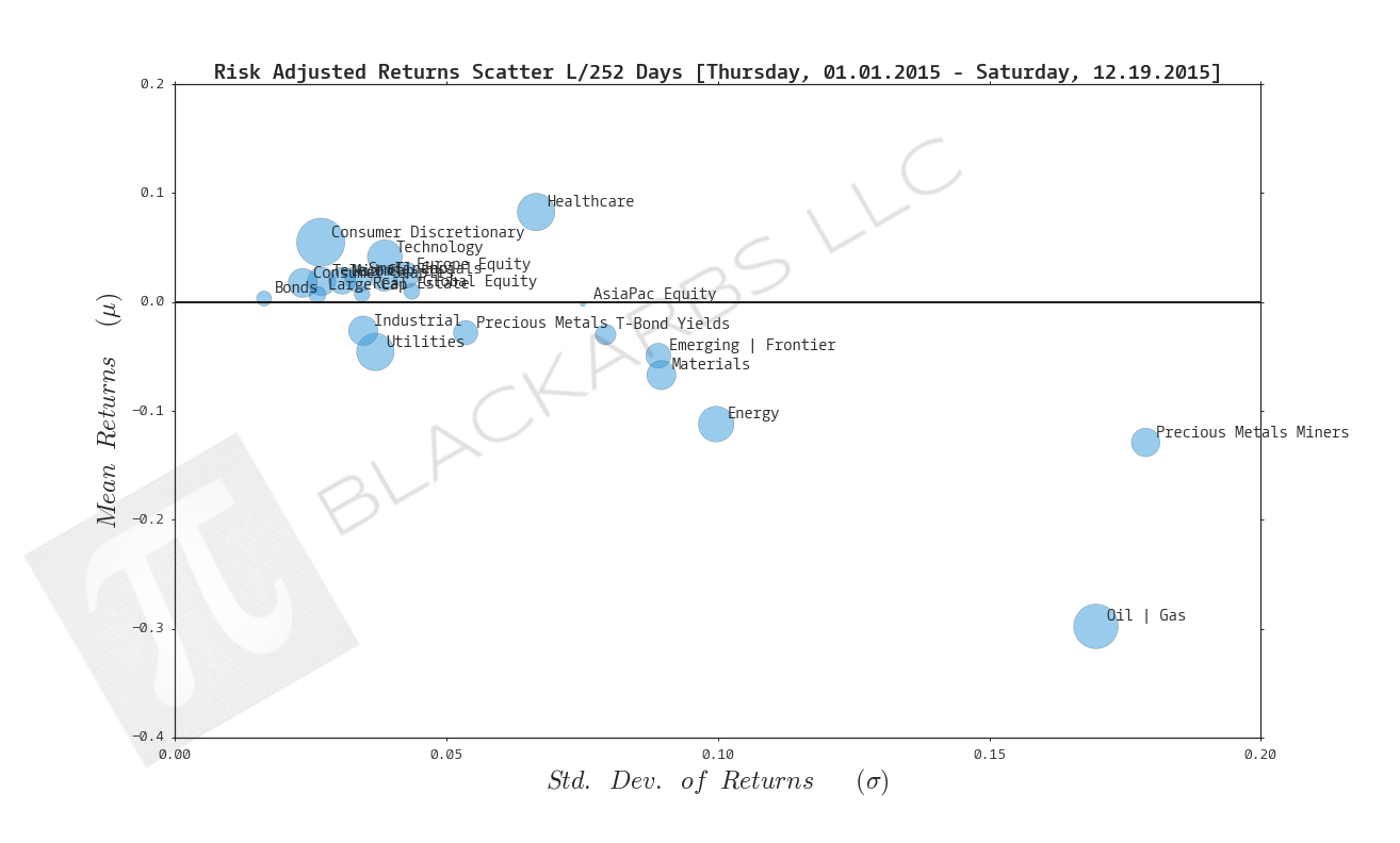
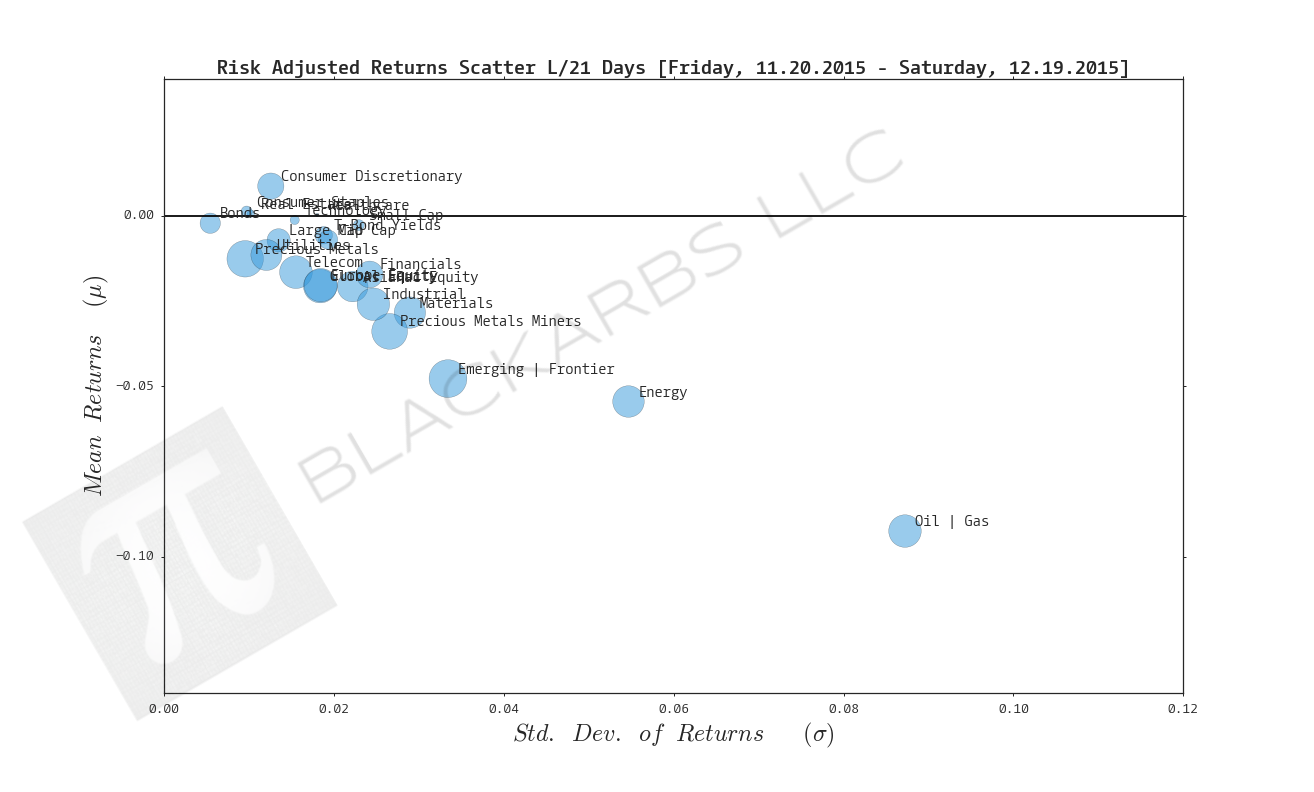
Composite ETF Risk-Adjusted Returns Scatter plot (Std vs Mean)
Composite ETF Risk-Adjusted Return Correlations Heatmap (Clusterplot)
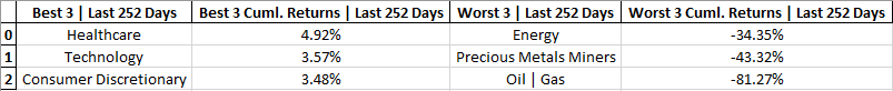
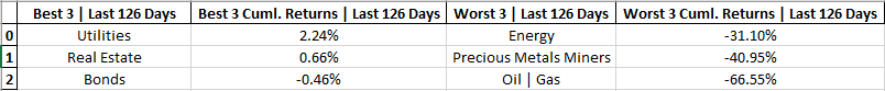
Composite ETF Cumulative Return Tables
Notable Trends and Observations
COMPOSITE ETF COMPONENTS:

LAST 252 TRADING DAYS

Click here for help understanding this chart

Click here for help understanding this chart

Click here for help understanding this chart

Click here for help understanding this chart
LAST 126 TRADING DAYS

Click here for help understanding this chart

Click here for help understanding this chart

Click here for help understanding this chart

Click here for help understanding this chart
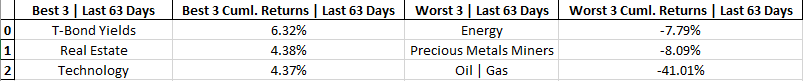
LAST 63 TRADING DAYS

Click here for help understanding this chart

Click here for help understanding this chart

Click here for help understanding this chart

Click here for help understanding this chart
LAST 21 TRADING DAYS

Click here for help understanding this chart

Click here for help understanding this chart
Click here for help understanding this chart

Click here for help understanding this chart
LAST 10 TRADING DAYS

Click here for help understanding this chart

Click here for help understanding this chart

Click here for help understanding this chart

Click here for help understanding this chart
Cumulative Return Tables:


Notable Observations and Trends:
- The Healthcare composite has shown the most durable positive, relative performance of the groups. It has been a top 3 performer over the last 252, 21, 10 trading day periods.
- Over the last 63 trading days Treasury bond yields have been the number 1 performer. If Treasury yields continue to outperform, it's likely that any selloff in equities will reverse course.
- Energy and Oil + Gas continue to underperform across time periods with no end in sight.
- Precious Metals Miners are also hurting over the last 252, 126 and 63 day time frames. I wonder if, at some point a bullish case could be made given that their largest input (Oil and Gas) continue to decline in price.
- It's interesting that over the last 21 trading day period there were no composite groups with positive cumulative returns.