LAYOUT (Organized by Time Period):
Composite ETF Cumulative Returns Momentum Bar plot
Composite ETF Cumulative Returns Line plot
Composite ETF Risk-Adjusted Returns Scatter plot (Std vs Mean)
Composite ETF Risk-Adjusted Return Correlations Heatmap (Clusterplot)
Composite ETF Cumulative Return Tables
Notable Trends and Observations
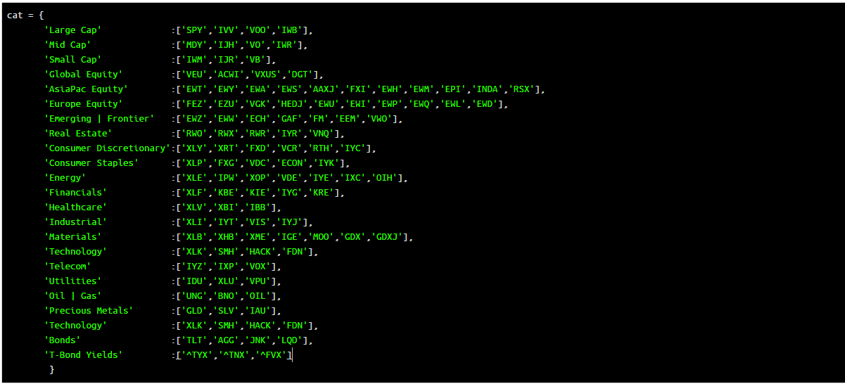
COMPOSITE ETF COMPONENTS:
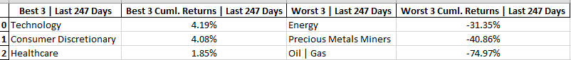
YEAR-TO-DATE LAST 247 TRADING DAYS

Click here for help understanding this Chart

Click here for help understanding this Chart

Click here for help understanding this Chart

Click here for help understanding this Chart
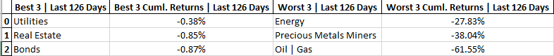
LAST 126 TRADING DAYS

Click here for help understanding this Chart

Click here for help understanding this Chart

Click here for help understanding this Chart

Click here for help understanding this Chart
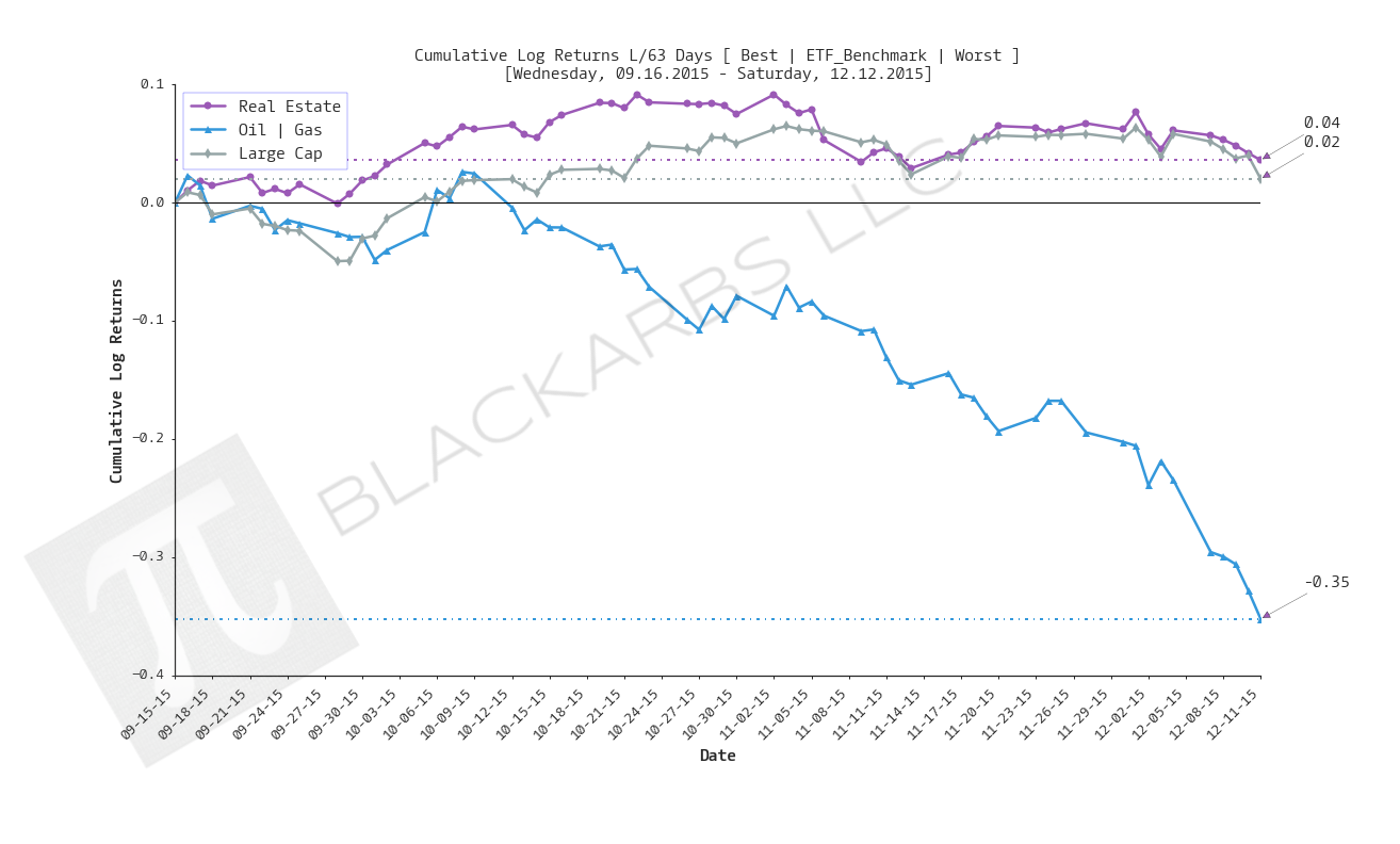
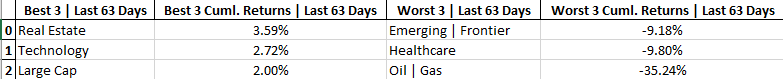
LAST 63 TRADING DAYS

Click here for help understanding this Chart

Click here for help understanding this Chart

Click here for help understanding this Chart

Click here for help understanding this Chart
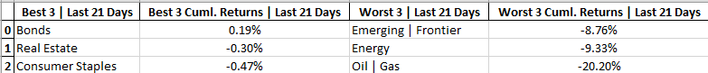
LAST 21 TRADING DAYS

Click here for help understanding this Chart

Click here for help understanding this Chart

Click here for help understanding this Chart

Click here for help understanding this Chart
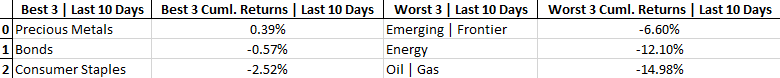
LAST 10 TRADING DAYS

Click here for help understanding this Chart

Click here for help understanding this Chart

Click here for help understanding this Chart

Click here for help understanding this Chart
Cumulative Return Tables:
Notable Observations and Trends:
- Energy has been a bottom 3 performer in 4 out of 5 time frames.
- Oil and Gas has been a bottom 3 performer in all 5 time frames.
- Real Estate, and Bonds are the only two composites to be among the top 3 performers in 3 different time frames.
- Technology and Consumer Staples are the only composites to be among top 3 performers in 2 different time frames.
- Precious Metals Miners are the only composite to appear among the worst 3 performers (YTD, L/ 126 days) and best 3 performers (L/ 10 days). Is this a sign of a trend change or simply catastrophe insurance given the recent sell-off in the market?
- Utilities have had positive risk-adjusted returns in 3 different time frames (Last 126, 63, 21 days).
- Only Precious Metals Miners have had positive risk adjusted returns over the last 10 trading days.