
This is the Python version of a guest article that originally appeared on RectitudeMarket.com. In this version I include the Python code used to generate the anaylsis.
This subject has garnered a healthy debate among market participants in recent weeks. Conventional wisdom says that banks and the financial sector overall should benefit from a rising rate environment. The story goes that bank profitability is inextricably linked to `Net Interest Margin (NIM)`. If rates are rising, it is assumed the likely result of a strong economy, during which banks should be able to charge more for the funds they loan, while also increasing loan volume.
A popular analysis on SeekingAlpha.com written by industry veteran Donald van Deventer, makes the case that bank stock prices are negatively correlated to interest rates. While I appreciate the detail and skill of the writer I thought the analysis left some `meat on the bone` so to speak.
- He concludes "Bank Stock Prices are Negatively Correlated with Higher Interest Rates". I believe this is not actionable for an investor today and in fact answers the wrong question.
- As an investor the most important variables are the returns from ownership of an asset. The prices themselves are of minimal importance.
- This analysis shows that traditional correlations between rates and financial stocks have been changing.
- My analysis shows the cumulative returns from ownership of financial stocks including the 'Major Banks' Industry Classification are distinctly positive over the period of study.
- My analysis shows that cumulative returns from ownership of bank stocks given yields are falling, are highly negative having peaked around 2002-03.
Before I describe the results of this analysis I must make several disclosures regarding the datasets used.
First and foremost all the analysis was done in Python. I exported all available symbols listed on the Nasdaq and NYSE exchanges from the Nasdaq website. I filtered the symbols first by ‘Finance’ sector. Then I used a market cap filter of greater than $1 billion. Finally I grouped the data by industry and dropped any industry symbols where the total industry was represented by less than 5 symbols.
I used the filtered set of symbols and collected <= 25 years of data from Yahoo Finance using ‘adjusted close’ prices. Unfortunately there are obvious gaps in the data. I tried to minimize the effects by resampling the daily data into weekly data and using rolling means, returns, correlations etc. where appropriate. I am unsure of the exact issue behind the data gaps, but I don’t believe it invalidates the general interpretation of the analysis.
I then collected <= 25 years of Treasury yield data for 5, 10, and 30 year maturities using the symbols ‘^FVX’, ‘^TNX’, ‘^TYX’, respectively.
Note: The following code block shows how I downloaded the data and created the indices for both dataframes so that I could merge the data together for easier analysis.
After collecting all the data Yahoo Finance had to offer I created financial industry composites using an equal weighted average of the returns of each stock within each industry. I narrowed the focus to the following industries: Major Banks, Investment Bankers/Brokers/Service, Investment Managers, and Commercial Banks.
I grouped all the calculations into one code block for ease of reference.
Note: I did not show the plot code I used b/c I did not want to distract too much from the actual analysis. If anyone is interested in how I generated the following charts, contact me.
Rolling Mean Returns appear to show regime shift in correlations
Looking at the following chart there appears to be a distinct change in the behavior of 52 week rolling mean returns. I z-scored the data for easier interpretation but the raw data shows the same relationships. In the period before ~2004 it appears that Treasury rates and rolling average returns are indeed negatively correlated as they clearly oscillate in opposition. However at some point approximately between Q4 2002 and Q1 2004 this relationship changed as the rolling mean returns appear to move in sync with rates afterwards in a loosely positive correlation.
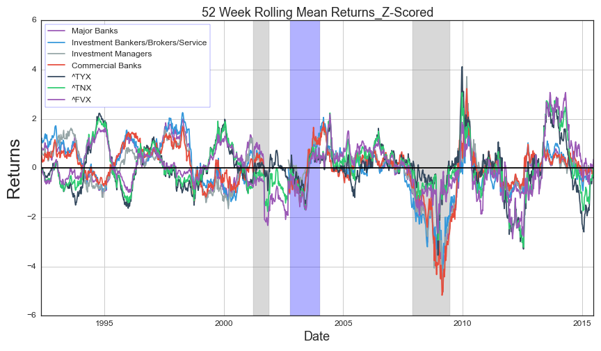
Recessions shaded in gray. Theorized regime change shaded in blue.
Rolling Correlations support theory of regime shift in correlations
This next plot shows the 52 week correlations of the composite industries compared to each of the Treasury yield maturities. There is a clear gap in the data, however we can see that prior to my theorized regime shift there were multiple long periods where correlations between rates and the composites were negative (< 0.0). Since then, the correlations have oscillated between highly positive (~>0.5) and 0, with short duration of actual negative correlations.
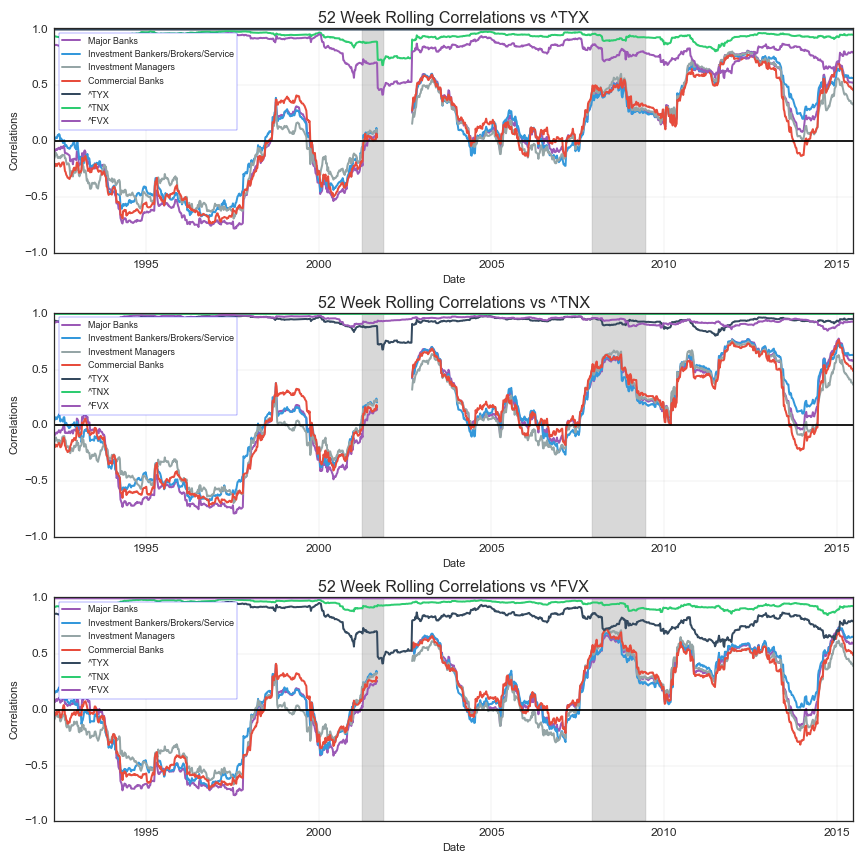
Recessions shaded in gray.
Cumulative Returns during periods of rising rates are highly positive since 2002-2003
Next I analyzed the data filtered to include only financial industry composite returns during periods where the changes in rates were positive (> 0.0). I did this for each of the three maturities and calculated the cumulative sum. All three charts show negative or zero returns prior to the 2002. Afterwards beginning around 2003, composite returns begin rising together until present day! This result is a clear indicator of two concepts.
- There is a high probability of a regime change in the data-set
- More importantly, this chart shows that investors had more opportunity to gain from being long financial stocks during periods of rising rates than the alternative.
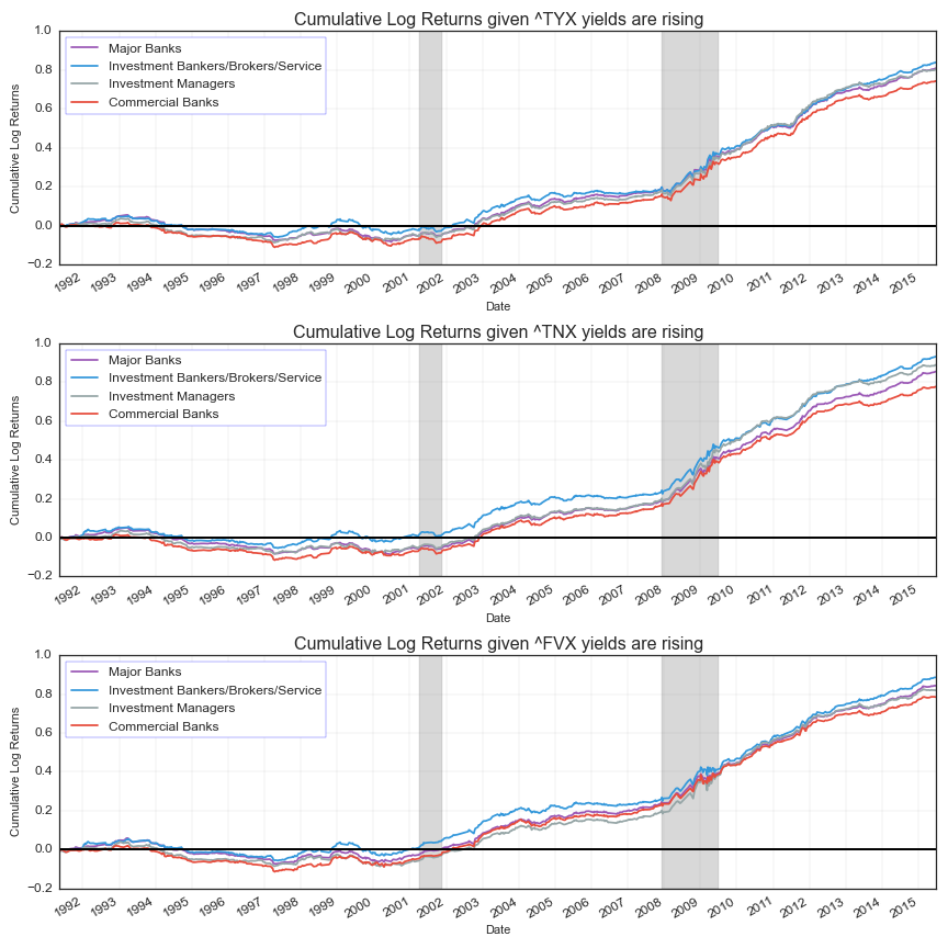
Recessions shaded in gray
Cumulative Returns during periods of falling rates peaked around 2002-03 and are highly negative since
For comparison I filtered the composite returns to periods where the changes in rates were negative (< 0.0). I did this for each of the three yield maturities. This chart also supports the theory of a regime change in the data set. More importantly, it shows that every composite industry except ‘Investment Managers’ peaked during the 2002-2003 time period and all have been in steep decline since ~2007. Currently all composites show negative cumulative returns.
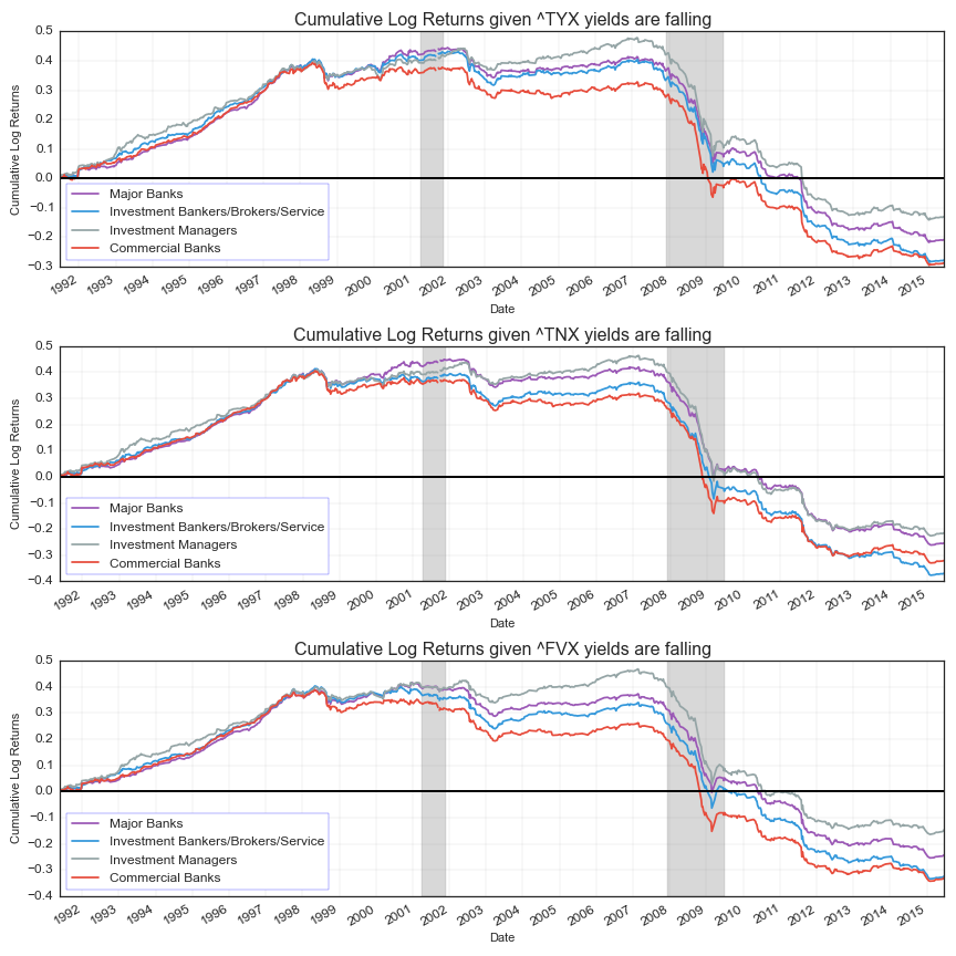
Recessions shaded in gray
Conclusions
This analysis has some areas worth further investigation and it certainly has some weak points. However, we can make some strong informed conclusions.
- Analysis of financial composite prices and yield changes are not enough for an investor to make an informed portfolio decision.
- There appears to be a clear regime change in the data-set. Therefore, investment decisions today based on analysis prior to the regime change can give conflicting results, and lead to sub-optimal investment allocations and unnecessary losses.
- When analyzing the conditional financial composite returns during the most recent regime, this research shows investors had significantly more gains given periods of rising rates than periods of falling rates!
Feel free to contact me with questions, comments, or feedback: BCR@BlackArbs.com @blackarbsCEO