PythonEducation
Advanced Time Series Plots in Python
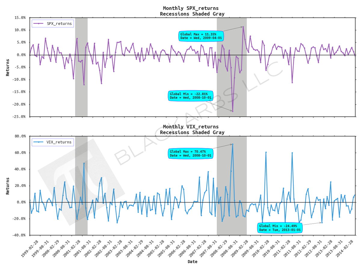
POST OUTLINE 1. Motivation 2. Get Data 3. Default Plot with Recession Shading 4. Add Chart Titles, Axis Labels, Fancy Legend, Horizontal Line 5. Format X and Y Axis Tick Labels 6. Change Font and Add Data Markers 7. Add Annotations 8. Add Logo/Watermarks MOTIVATION Since I started this blog a few years ago, one of my obsessions is creating good looking, informative plots/charts. I've spent an inordinate amount of time learning how to do this and it is still a work in a progress. Howe
READ MORE →