Advanced Time Series Plots in Python
POST OUTLINE
- Motivation
- Get Data
- Default Plot with Recession Shading
- Add Chart Titles, Axis Labels, Fancy Legend, Horizontal Line
- Format X and Y Axis Tick Labels
- Change Font and Add Data Markers
- Add Annotations
- Add Logo/Watermarks
MOTIVATION
Since I started this blog a few years ago, one of my obsessions is creating good looking, informative plots/charts. I've spent an inordinate amount of time learning how to do this and it is still a work in a progress. However all my work is not in vain as several of you readers have commented and messaged me for the code behind some of my time series plots. Beginning with basic time series data, I will show you how I produce these charts.
get data
Import packages
Get time series data from Yahoo finance and recession data from FRED.
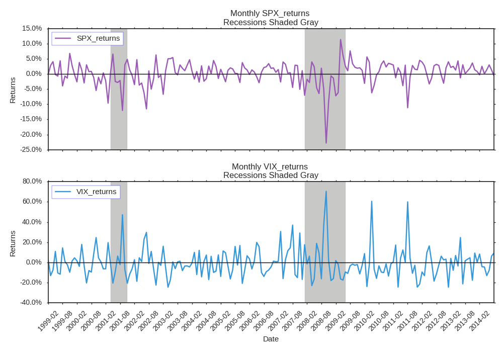
DEFAULT PLOT WITH RECESSION SHADING
Now we have to setup our recession data so we can get the official begin and end dates for each recession over the period.
Now we can plot the default chart with recession shading. Let's take a look.
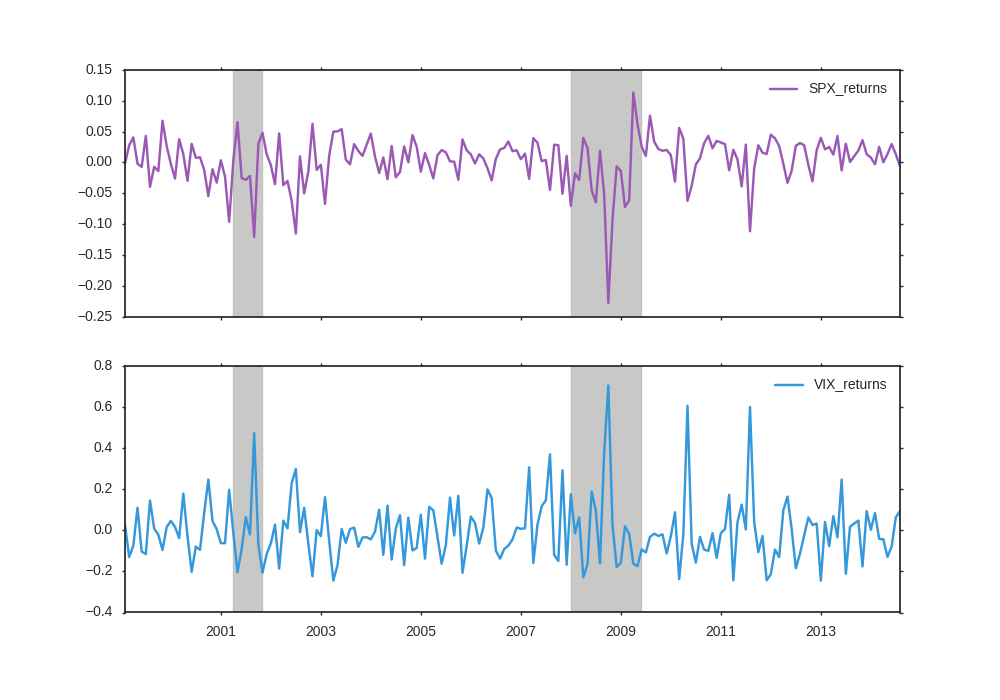
The default plot is ok but we can do better. Let's add chart titles, axis labels, spruce up the legend, and add a horizontal line for 0.
ADD CHART TITLES, AXIS LABELS, FANCY LEGEND, HORIZONTAL LINE
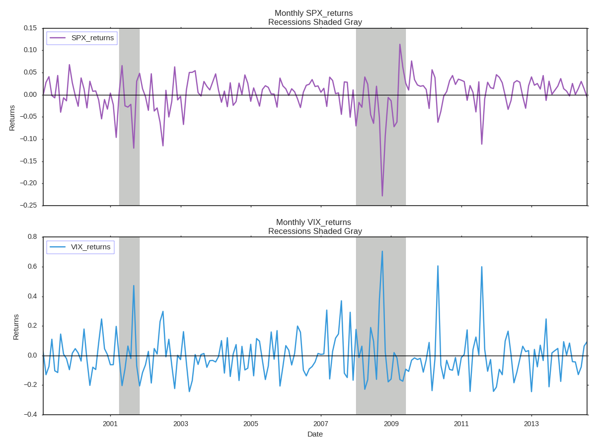
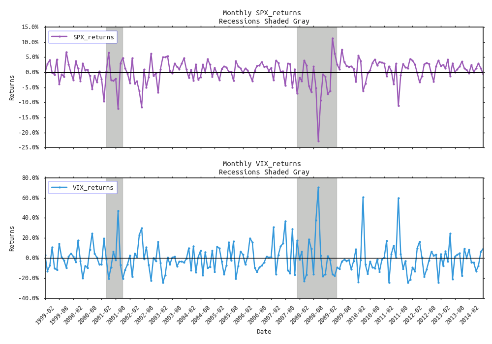
This is a step up but still not good enough. I prefer more informative dates on the x-axis, and percent formatting on the y-axis.
Format X and Y axis tick labels
It's an improvement, but I hate Arial font, and would like to add data point markers.
change font and add data markers
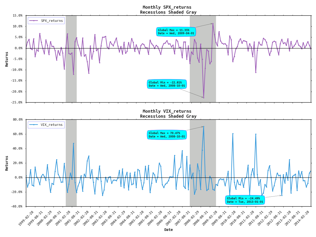
It's starting to look pretty good, but we can get even more fancy. Say we wanted to annotate the global maximum and minimum returns in each subplot along with their respective dates for SPX and VIX . That could be a challenge. To do this we first need to extract the max/mins and idxmax/idxmin for both series.
add chart annotations
Now that we have this information we can get clever with the annotation tools Matplotlib provides. Also, I want to touch up some of the axis labels and axis tick labels as well.
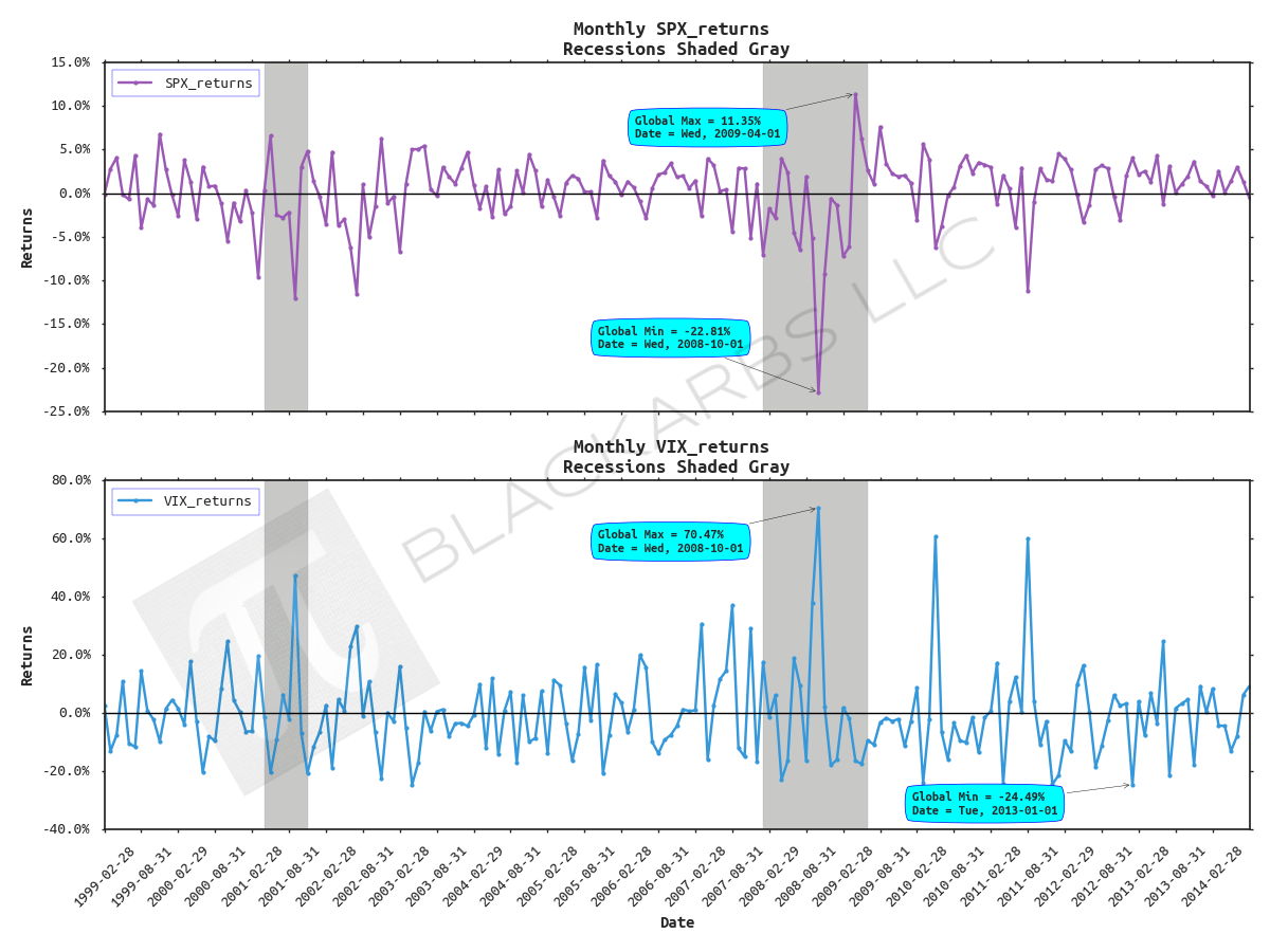
Wow, now it's looking really good. But what if you wanted to insert branding via a watermark? That's simple, add the following line of code before the plt.tight_layout() line and voila.
add logo/watermark

Enjoyed this post?
Subscribe for more research and trading insights.
By clicking "Subscribe," you agree to our Terms of Use and acknowledge our Privacy Policy. You can unsubscribe at any time.
No spam. Unsubscribe anytime.