COMPOSITE MACRO ETF IMPLIED COST OF CAPITAL ESTIMATES

Earlier this year I used to publish a bi-weekly article using the "Implied Cost of Capital" model as an ETF relative value estimation tool. Unfortunately State Street began reporting obvious erroneous data points and eventually stopped providing certain fundamental data altogether. As a result I had to suspend publishing of my ICC estimates. 

Well thanks to YCharts.com and their excellent site I was able to find the requisite data needed to begin publishing my model estimates again. 

what is the "implied cost of capital (ICC)" model?

In accounting and finance the implied cost of equity capital (ICC)—defined as the internal rate of return that equates the current stock price to discounted expected future dividends—is an increasingly popular class of proxies for the expected rate of equity returns.
— CHARLES C. Y. WANG; an assistant professor of business administration in the Accounting and Management Unit at Harvard Business School

The basic concept of the ICC model is that it is a forward looking estimate of the implied earnings growth rate of an equity security that is calculated using a combination of book value of equity and earnings forecasts.

To see a more involved explanation of the previous model I used see here.  

In the past I used a Multi-Stage Residual Income Model. However, this time around I've decided to use a simpler Single-Stage Residual Income Model for these estimates. I chose this because I believe the additional complexity is not warranted given my purpose which I will elaborate on further.

The Single-Stage Residual Income Model as defined by the CFA Institute is the following:

source: CFA Institute

'V' is the stock price at time 0, 'B' is the book value of equity at time 0, 'ROE' is return on equity, 'g' is an assumed long term growth rate and 'r' is the cost of equity/capital. The ICC model essentially solves for 'r' given the other inputs. 

why use the implied cost of capital model?

There is ongoing debate regarding the ICC model's application and accuracy as a proxy for expected returns as quoted by Charles C. Y. Wang. As an investor/trader I'm less interested in the academic debate and more intrigued by the intuition behind the model and its practical application as a relative value tool. 

I use the ICC model as a relative value measure to identify analyst/institutional expectations and sentiment between different market sectors at a point in time. 

For this purpose I believe it provides great insight. 


category average icc estimates

Long term growth rate (g) is assumed to be 2.5% reflective of our low growth high debt economic environment. 


all etf icc estimates by category


z-Score icc estimates and cumulative returns comparison chart

The below plot gives visual representation of the ICC estimates. I z-scored both year-to-date cumulative returns and the ICC estimates so we can view them on the same scale. Examining this chart allows investors to quickly determine which market sectors are outperforming (underperforming) their respective Implied Cost of Capital Estimates. 

The extreme cases show where there are disconnects between the analyst community's forward earnings expectations and actual market performance. The plot is sorted left to right by ascending ICC estimates.

Data Sources: YCharts.com, Yahoo Finance

Data Sources: YCharts.com, Yahoo Finance

COMPOSITE MACRO ETF WEEKLY ANALYTICS (10/31/2015)

NEW LAYOUT: 

Going forward I will be testing a new organizational format for the charts. I have created a chart description page which details how each plot type is commonly interpreted (used). I will provide a link to the chart description page in the caption of each chart. The primary change is all the chart types will be grouped by the referenced time period. It is my hope that grouping the data this way will allow for easier analysis. Each time period grouping will display the charts in the following order: 

  1. Composite ETF Cumulative Returns Momentum Bar plot and associated Tables

  2. Composite ETF Cumulative Returns Line plot

  3. Composite ETF Risk-Adjusted Returns Scatter plot (Std vs Mean)

  4. Composite ETF Risk-Adjusted Return Correlations Heatmap (Clusterplot)


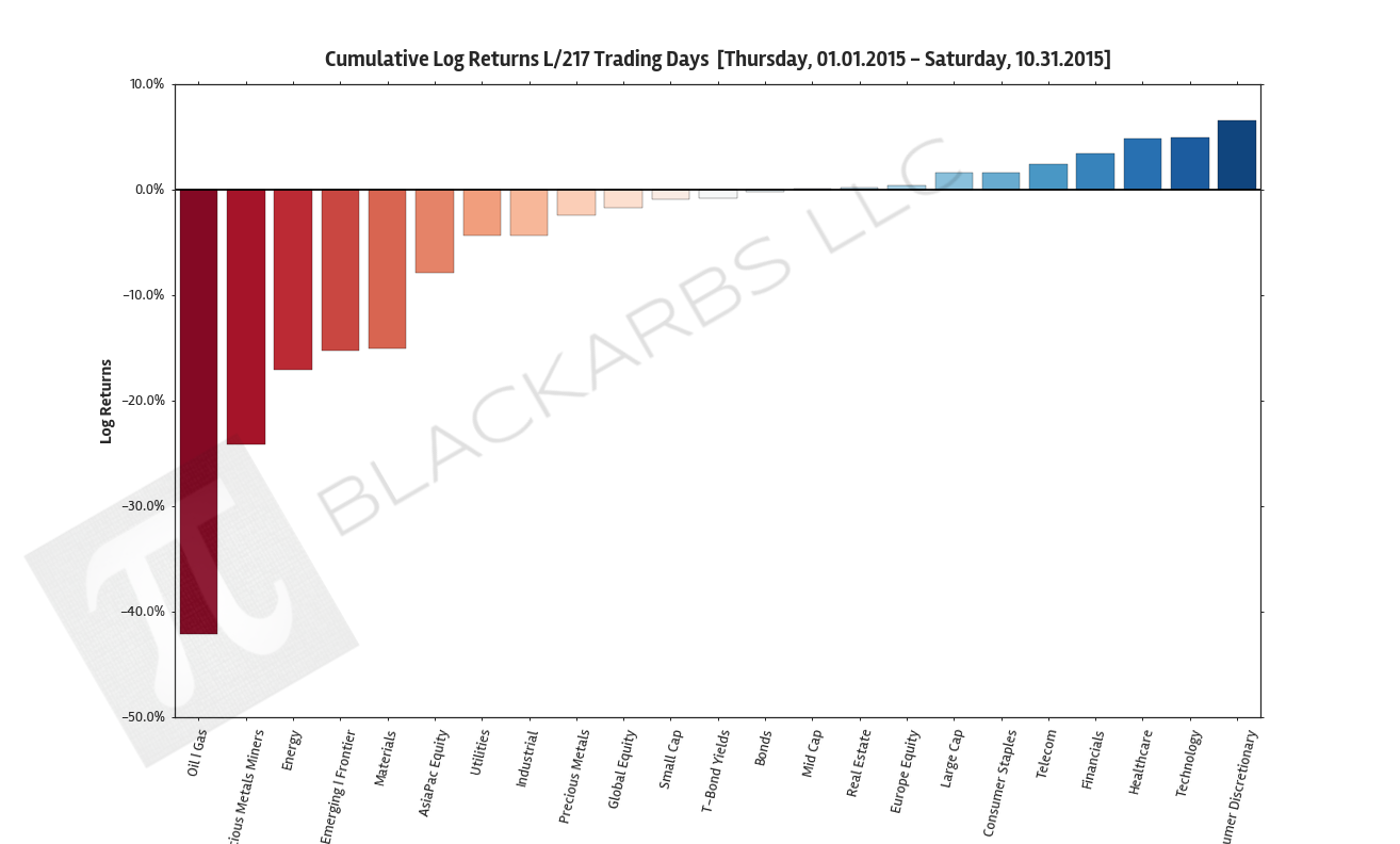
YEAR-TO-DATE LAST 217 TRADING DAYS

LAST 63 TRADING DAYS

LAST 21 TRADING DAYS

LAST 10 TRADING DAYS

COMPOSITE MACRO ETF WEEKLY ANALYTICS (10/25/2015)

COMPOSITE ETF CUMULATIVE RETURN MOMENTUM

These charts show the sum (cumulative) of the daily returns of each composite ETF over the specified period. The daily return is calculated as the log of the percent change between daily adjusted close prices.

These charts help determine asset class return momentum. This is important because momentum is arguably the strongest and most persistent market anomaly. Poorly performing asset classes are likely to continue under performing while outperforming asset classes are likely to continue their relative strength. 

year-to-date LAST 212  TRADING DAYS

LAST 63 TRADING DAYS

LAST 21 TRADING DAYS

LAST 10 TRADING DAYS

COMPOSITE ETF CUMULATIVE RETURN (BEST VS WORST VS BENCHMARK)

These charts visualize the cumulative return performance of the best and worst performing asset classes over the specified period. These best and worst asset classes are then compared to a benchmark ETF composite represented by the Large Cap category. 

These charts help give investors an idea of how an actual investment in the represented asset classes would have performed over the period in percentage terms. This also helps visualize the relative strength or weakness of various asset classes as compared to the most common Large Cap benchmarks.

YEAR-TO-DATE LAST 212  TRADING DAYS

LAST 63 TRADING DAYS

LAST 21 TRADING DAYS

LAST 10 TRADING DAYS

COMPOSITE ETF Z-SCORES OF AVERAGE ROLLING RISK ADJUSTED RETURNS

These charts show the z-scored average of the composite ETF's rolling risk adjusted returns.  Risk adjusted returns are used to improve the robustness of the chart and the information presented. 

By examining the standardized values we can see how each asset class performed relative to the group. This adds further clarity to the relative strength (weakness) of asset class return performance. 

YEAR-TO-DATE LAST 212 TRADING DAYS; ROLLING PERIOD = 21 DAYS

LAST 63 TRADING DAYS; ROLLING PERIOD = 10 DAYS

LAST 21 TRADING DAYS; ROLLING PERIOD = 5 DAYS

LAST 10 TRADING DAYS; ROLLING PERIOD = 5 DAYS

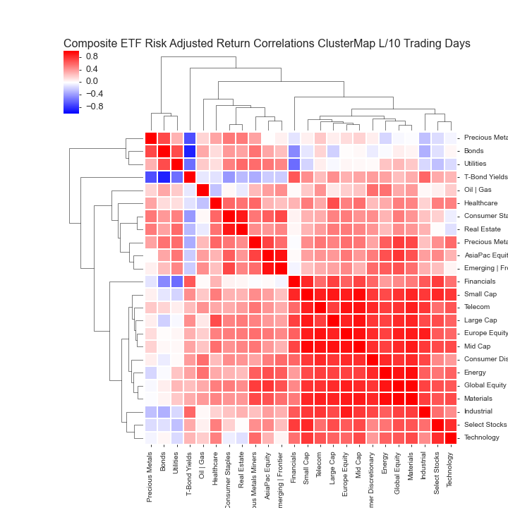
COMPOSITE ETF RISK-ADJUSTED RETURN CORRELATIONS HEATMAP CLUSTERPLOTS

These charts visualize the correlations of the asset class returns over the specified period. Red indicates highly correlated returns while blue indicates negatively correlated returns. 

By examining a clustered heatmap investors are able to quickly determine the intensity and grouping of asset return correlations. Generally speaking, investors should seek to diversify their portfolios by holding uncorrelated assets. Better diversification among asset classes helps to lower overall portfolio volatility with the implication of improving a portfolio's long term performance. 

YEAR-TO-DATE LAST 212 TRADING DAYS

LAST 63 TRADING DAYS

LAST 21 TRADING DAYS

LAST 10 TRADING DAYS

All data sourced from Yahoo Finance API

COMPOSITE MACRO ETF WEEKLY ANALYTICS (10/18/2015)

COMPOSITE ETF CUMULATIVE RETURN MOMENTUM

These charts show the sum (cumulative) of the daily returns of each composite ETF over the specified period. The daily return is calculated as the log of the percent change between daily adjusted close prices.

These charts help determine asset class return momentum. This is important because momentum is arguably the strongest and most persistent market anomaly. Poorly performing asset classes are likely to continue under performing while outperforming asset classes are likely to continue their relative strength. 

LAST 63 TRADING DAYS

LAST 21 TRADING DAYS

LAST 10 TRADING DAYS

COMPOSITE ETF CUMULATIVE RETURN (BEST VS WORST VS BENCHMARK)

These charts visualize the cumulative return performance of the best and worst performing asset classes over the specified period. These best and worst asset classes are then compared to a benchmark ETF composite represented by the Large Cap category. 

These charts help give investors an idea of how an actual investment in the represented asset classes would have performed over the period in percentage terms. This also helps visualize the relative strength or weakness of various asset classes as compared to the most common Large Cap benchmarks.

LAST 63 TRADING DAYS

LAST 21 TRADING DAYS

LAST 10 TRADING DAYS

COMPOSITE ETF Z-SCORES OF AVERAGE ROLLING RISK ADJUSTED RETURNS

These charts show the z-scored average of the composite ETF's rolling risk adjusted returns.  Risk adjusted returns are used to improve the robustness of the chart and the information presented. 

By examining the standardized values we can see how each asset class performed relative to the group. This adds further clarity to the relative strength (weakness) of asset class return performance. 

LAST 63 TRADING DAYS; ROLLING PERIOD = 10 DAYS

LAST 21 TRADING DAYS; ROLLING PERIOD = 5 DAYS

LAST 10 TRADING DAYS; ROLLING PERIOD = 5 DAYS

COMPOSITE ETF RISK-ADJUSTED RETURN CORRELATIONS HEATMAP CLUSTERPLOTS

These charts visualize the correlations of the asset class returns over the specified period. Red indicates highly correlated returns while blue indicates negatively correlated returns. 

By examining a clustered heatmap investors are able to quickly determine the intensity and grouping of asset return correlations. Generally speaking, investors should seek to diversify their portfolios by holding uncorrelated assets. Better diversification among asset classes helps to lower overall portfolio volatility with the implication of improving a portfolio's long term performance. 

LAST 63 TRADING DAYS

LAST 21 TRADING DAYS

LAST 10 TRADING DAYS

All data sourced from Yahoo Finance API